Windows 10 – How to Deal with Color and Add Basic Missing Features

I needed a powerful graphics card for purposes unrelated to photography, but unfortunately Macs do not support such GPUs. So the only thing left to do was to buy a better card and switch to Windows. Initially, I was going to use 2 computers, but I decided to check if I could live on one. So, I have been using Windows for less than 1.5 years, and exclusively for it for several months. Of course, Windows has huge color problems, but also many shortcomings in terms of usability compared to Macs, so below I describe how I deal with it. First, things that make life easier and make the system look at least a little nicer, and then things related to colors, i.e. those without which it would be impossible to live on Windows at all. This is one of those articles that will probably grow a lot over time.
Last updated: 14/06/2021. I added a chapter on File Explorer, Taskbar, PowerToys and updated the chapter on keyboard (I now also use Beeftext to replace text).
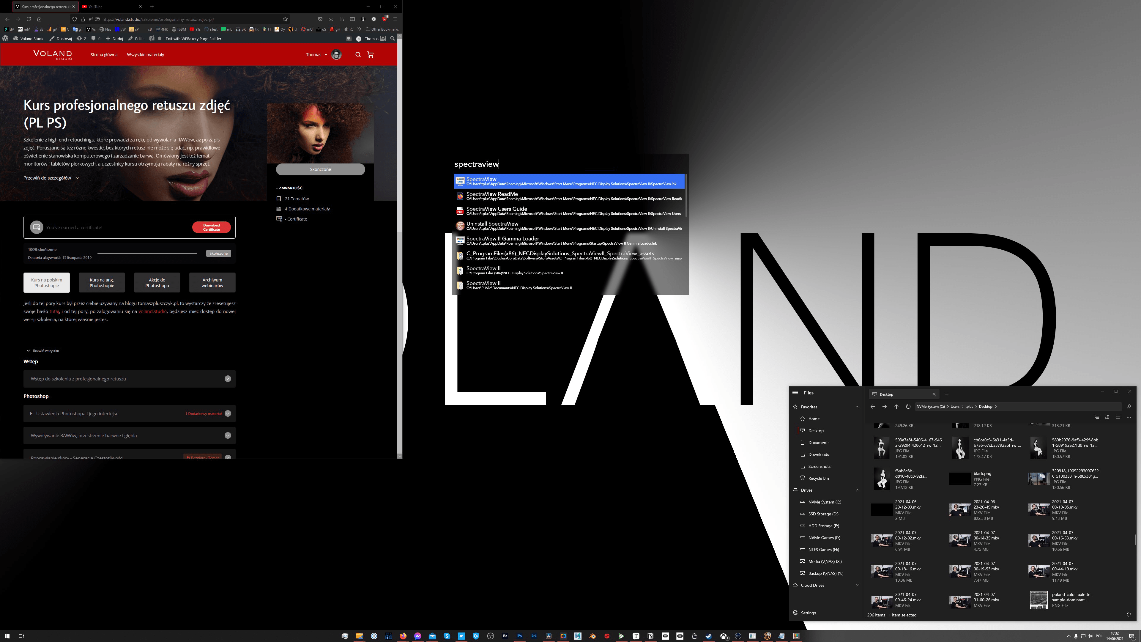
Table of contents
Ease of use, productivity, and appearance:
- Trackpad
- Keyboard
- Spotlight and Alfred – Wox
- File Explorer – Files
- Screenshots – screen captures
- Taskbar
- PowerToys
- Web browser
Correct image display:
- Wallpaper and icons
- Tonal range and RGB format
- Forgetting display profiles
- Photos and graphics displayed in wrong colors
- Colors in a web browser
Trackpad
On Windows, but also on a Mac for over a year, my primary controller is the Logitech MX Master 3 mouse, but the trackpad on the left side of the keyboard is still used to zoom timelines, etc. To regain as many functions as possible of Apple Magic Trackpad 2, I use Windows Precision Touchpad Driver.

Unfortunately, due to the lack of a program BetterTouchTool on Windows, Trackpad functionality is small (even smaller than standard in macOS). However, it is still much better than standard on Windows. Additionally, Precision fixes the operation of many touchpads on Windows laptops, and it's always worth having this driver if you have a compatible touchpad model.
Keyboard
If you only use Windows, there is no problem, but if you use PC, Mac and iPad alternately, you can go crazy due to the different keyboard behavior. I don't mean that a different button is used to enter Polish characters, because this can be easily changed in Apple systems (or in a more advanced way with the Karabinier application). What's worse is that, for example, alt + left arrow does not move the cursor one word to the left, that CMD + W does not close the tab or window, etc. On Mac keyboards, the problem is solved by remapping one button with Sharp Keys and then using this script to the free program AutoHotKey. You can also remap buttons using PowerToys, which I describe later in this article.
However, I use a slightly modified version of the script because I no longer use Apple keyboards. However, my Keychron keyboards, model K1 (I described it here) and K6, have a switch from Mac to Windows, and I wanted to have typical Windows function buttons. Currently, I use Moonlander as my main keyboard, which is fully programmable, so in its case the script is only useful for shortcuts like CTRL/CMD + W.
Text replacement
Windows does not have a built-in text replacement tool. For me, only the basic functionality is enough, so I used the free one for that aText, and currently Beeftext. So, just like on Apple devices, I can enter "vs" and it will turn into "https://voland.studio", entering ",invoice" will insert all company data, etc. Unfortunately, aText does not support lines - it puts everything in one line and that's why I switched to Beeftext, which in turn has problems with respecting the space settings. So eventually I will probably use both programs - Beeftext for multi-line texts and aText for the rest. Of course, neither of these programs synchronizes with what I have set in iOS on the iPhone.
Moreover, in Windows there is no way to enter, for example, the "–" character that I use every now and then. There is only "-". That's why in aType I set "-" to "-" if I press the space bar after entering the minus sign. I also created my own keyboard layout (here is the manual) – a modified version of the "Polish (programmer)" layout, with the addition of the above-mentioned pause sign (–), but also degrees (°) and the ellipsis (…), which is especially useful on Twitter.
Spotlight and Alfred – WOX
The Windows search engine, compared to the Mac one, is so embarrassing that when browsing the results I usually looked like Picard in the famous meme... I fixed this situation by installing Wox application, along with Search Everything (the Wox installer has this in it). Now, by pressing CMD + spacebar, I have a search window that is not as good as Spotlight, but 100 times better than Windows search.

However, I still use this Windows search engine to access various configuration options of the operating system. Wox also has basic Alfred functions, so I can, for example, search directly on Amazon, YouTube, or even on my blog, or, for example, in orders, on my training platform. There is also plugin support, although not as good as in Alfred. Unfortunately, when I turned on the mobile mode, my own search engines stopped working and it was impossible to create them again - only deleting all the settings files and reinstalling the program fixed this problem.
File Explorer – Files
Windows Explorer, apart from its ugliness, has one more disadvantage - it does not support tabs. Using this with previous experience with macOS is torture. Instead of the native file browser, I use the "Files" application.

It is free and does not overwrite the original Explorer, but you can run it like any other application and browse your drives this way. However, e.g. when saving a file in a program, the standard window will still appear. Unfortunately, the stability of this program on my computer is poor - it simply turns off for some folders.
Screenshots – screen captures
I had a great app on macOS CleanShotX in SetApp, and the tool built into the system wasn't terrible either (at least until I used something better). Unfortunately, the Windows screenshot tool is poor, so I have a free one ShareX, which has 10 times more features than I need, but I only use the basic ones. Screenshots are saved in folders sorted by months, and immediately after being taken, they are also sent to the clipboard, so I usually use ctrl + V to put them where I want. The app itself also allows you to manage files, but I never do it this way.

Taskbar
For well over a year, I didn't get used to the ugly alignment of icons to the left side of the taskbar, so I used the program TaskbarX. In addition to centering the icons, it allows you to slightly change the appearance.

There is a free version, but if you use the Microsoft store, you have to pay a very low fee. It is true that you can move the icons to the center without any programs, but they are still aligned to the left side of the indicated place, so when you launch new applications, they will appear on the right side, and the left one will not move - TaskbarX solves this problem.
PowerToys
This is a Microsoft application with many functions, including: key remapping as in SharpKeys, but it works from the application level, not the registry, so it does not require relogging for the changes to take effect. Therefore, if for some reason PowerToys is turned off, the buttons will function as standard.

Another feature is a Spotlight-like search engine, but it lacks basic functionality and Wox crushes it in terms of functionality. However, there is a feature that I love – creating layouts for desktops. I divided my monitors into various smaller parts and now all I have to do is drag an application/folder onto one of them and the window size will adjust to the space I have defined. On UHD/4K screens this is a huge convenience.


There is also a pipette function for taking color from anywhere on the screen - I have it assigned to a keyboard shortcut, but I use it very occasionally. There are more functions, e.g. advanced file renaming, introduction of File Explorer support for markdown, SVG file previews, etc.
Web browser
There is no Safari for Windows, and I wanted everything to sync with Apple devices. Initially, I used Chrome with a synchronization plug-in, but thanks to one of the episodes of the Nadgryzieni podcast, I changed it to Firefox and it will probably stay that way. Anyway, I talked about it in the next episode, o here.
Instead of syncing with iCloud, I just use Firefox on my iPhone and iPad as well. There, Firefox is forced to use the Safari engine anyway.
In the photography industry, Firefox is very well known because for years it was the only web browser that allowed Windows to correctly see the colors of photos and graphics displayed on the Internet. This often required additional configuration, but the very fact that it was possible meant that you could use the Internet normally, with a wide gamut.
Later, other browsers began to introduce color management, but only in the last few years has it actually worked in them, although still not always.
Unfortunately, even in Firefox the colors will only be correct on the main screen, but this is normal - only Safari on Macs can change the profile during operation and even use several monitors. Unfortunately, such things on Windows are science fiction.

Correct image display
When it comes to color-sensitive work, Windows has always been a pain. To this day, there is no working color management, which means that the entire interface, icons, and even the desktop wallpaper are displayed in much brighter colors than sRGB or than the profile assigned to the wallpaper. How this should work is clearly visible on macOS, where everything is displayed according to its color space, and what is not defined uses sRGB. But I have already discussed this and all other problems in various articles and videos, so here I will just remind you that on Windows you cannot, for example, drag a program from one monitor to another, because the colors will be disturbed. After dragging to the second screen, the application must be restarted. There is nothing we can do about it, but there are issues that we can fix ourselves and I describe them below.
However, the simplest solution is still to use the monitor in sRGB mode, and switch it to wide gamut only when necessary. I have a hardware-calibrated monitor with the ability to switch several modes. So I have a photo editing mode with a wide gamut, I also have an sRGB mode and a few others, e.g. for gaming.
Wallpaper and icons
As I mentioned above - Windows cannot understand that for over a decade all professional monitors have had a wide gamut (and now many ordinary monitors go at least a little beyond sRGB) and still do not display the desktop wallpaper in its color space. Instead, colors are as bright as your monitor allows. So you can use some graphics that will look okay despite the changed colors, or prepare some wallpaper in the AdobeRGB or Prophoto RGB space, thanks to which it will not burn your eyes with unnatural colors (I have yet to test this method). You can also do what I did before I came up with the idea of a wide gamut wallpaper - use black and white wallpaper. Unfortunately, the icons have to be left with oversaturated colors, as well as the file thumbnails.

Tonal range and RGB format
This is an issue independent of the gamut. Windows uses TV settings for monitors much more often than macOS, which results in a massacre of tonal range. This is because monitors use RGB 0-255 and TVs use YCbCr 16-239. Usually the settings will be fine, but it is always necessary to check.
NVIDIA
You need to change the settings in the NVIDIA control panel. On the desktop right-click > NVIDIA Control Panel > Display > Change resolution.
In point 3, Output color format: RGB and Output dynamic range: Full must be set. You have to be careful that when you turn the mouse wheel, the cursor is not over any box, because then the selected option will change.

I will probably add instructions for Intel and AMD in the future.
Forgetting display profiles
For me, Windows sometimes mixes up the order of screens. While the main monitor always remains the main one, the second one can exchange its place with the third one. At the same time, the profiles of these screens are unfastened. It is not enough to go to the screen settings and select a color profile, because then there is none there. I then have to go to: Advanced display settings > Display adapter properties for Display > Color Management > Color Management.

In my case, monitors may have different numbering than in the display properties, so I always check by clicking "Identify monitors". Now you need to select a monitor from the drop-down list and check the "Use my settings for this device" option, then click the Add button and select the profile.
Photos and graphics displayed in wrong colors
Due to faulty color management, you can't trust what Windows shows as photo thumbnails at all, or when you run them in a standard application. This is a part of the system that works for some people, but even then it behaves differently in full-screen mode than in a window. On a monitor with a very wide gamut, it will be immediately obvious that something is very wrong, and on monitors set perfectly to sRGB, most photos will display correctly. But almost no one has the perfect sRGB, apart from people with pro monitors who had the gamut trimmed to sRGB during calibration - fortunately, I am one of the lucky ones who can do this.
I view my photos from the session in Lightroom or Adobe Bridge and process them in Photoshop. Each of these programs displays colors correctly on the main screen, although Bridge converts profiled photos to sRGB (unprofiled photos are displayed in full gamut). However, I have photos from my cell phone in iCloud, which I view from a web browser that manages the color. However, it would be useful to have some ultra-light program that would display it correctly after double-clicking on the photo. The native application will most often do it wrong, so you need to replace it with something else.
A popular choice is IrfanView with a color management plugin enabled. Unfortunately, it only displays photos according to profiles in the case of jpg and tiff, while PNG is a quite popular photo format with better quality than jpg. Unfortunately, it doesn't even work with JPG for me. Likewise FastStone and XnView MP. How to check it? The simplest way is to display the same graphics with an sRGB profile in Photoshop and in another program - they must look identical. If there is no color management, the colors will be more saturated (besides, there cannot be any difference).

I will still look for a light program with an actually working color management system, but since I have learned to use the sRGB mode in Windows and change it to another one if necessary, this problem very rarely bothers me. However, the only reason I use sRGB is because of all the Windows weaknesses - on the Mac I didn't have to worry about it at all and I could use the wide gamut non-stop.
Colors in a web browser
I already mentioned that browsers now manage color, so the situation is much better than before. However, sometimes problems still happen. I have a separate article about it: Colors of photos and graphics in browsers - explanation of problems and F.A.Q. However, in the article about computers I described in much more detail the problems of Windows in photographic applications - you will find it here. I need to update it with new hardware, but the first page is still fully up to date.