Finally, the time has come when it is easy to illuminate your computer workstation for retouching, graphic design, or video editing. In the past, there were many complications when people wanted to do it right. In the past almost everyone used fluorescent bulbs because other light sources had too many drawbacks for such use: incorrect color temperature, light focused in one point, or high energy consumption and heat production. Good LEDs did not exist at first and then were very expensive. Now we have a greater choice of lights with the correct specifications, including affordable LEDs that offer adjustable brightness and extended lifespan. Of course, the majority of LED lights are still rubbish but the most important thing is that finally there are some outstanding options worth considering.
This article was originally written in 2013 and later updated. In November 2019, it was completely rewritten with significant additions based on my experience and updated again in 2023. I provided more information about lighting placed behind the monitor and addressed frequently asked questions.
This article was originally written in 2013 and later refreshed later. In November 2019 the whole thing was rewritten and updated again in 2023.
- Why specially illuminate a computer workstation
- Basic principles of lighting a computer workstation for photo editing
- Fighting screen glare
- A very bright room or not so much?
- Lamp on the ceiling or behind the monitor
- Types of lamps
- My experience
- Summary
- F.A.Q. – answers to frequently asked questions
Why specially illuminate a computer workstation
Preparing a room for retouch is an absolute must. Without it, the photos will look different from the prints, and it will not be possible to set the correct contrast, brightness or colors, as I will illustrate with an example in a moment. Even the best monitors are of no use if you put them in an improperly lit area. The monitor is calibrated for specific lighting – differently for a bright room, differently for a dark room (and actually, for photos, it’s best to start with the monitor setting, then adjust the brightness of the lamp in the room). That’s why it’s hard to say you have a calibrated screen if you haven’t taken care of the lighting in your workspace – then it’s not calibration, just a failed attempt at it. In addition, a side effect of a well-prepared computer workstation, is the absence of eye fatigue, from staring at the screen for long periods of time.
Our eyesight works similarly to a camera – it has a limited tonal range and adapts to what it is pointed at. A monitor run at night, without additional light in the room, will give a completely different image than on a sunny day. More precisely – the monitor will give the same image, but the user will see it completely differently.
Do you know which of the following rectangles is darker?
I once showed a similar graphic, where both squares were identical. Since many of my readers already knew her, I made a change this time. In the graphic above, the square on the left is… darker. The right square is brighter than the left, and you can measure this for yourself in a graphics program or simply cover the surrounding squares with your hand, so that you have no doubt. A monitor is just that – a square that, depending on the background (i.e., the wall behind it), will be darker or lighter for us, high contrast or low contrast, more blue or more yellow, and so on. If the monitor’s environment is correct, that is, according to this article, the image on it will be seen correctly. It’s very hard to illustrate this with a photo on a tiny graphic, but I’ll try… The following photos are identical, only the surroundings differ:
Despite the lack of differences in the photo itself, the latter looks more contrasty and perhaps a bit too bright, with detail in the shadows. In the first photo you can’t see them. Simply preparing the processing station in the right way will make the problems disappear, and work will become much more comfortable. When it comes to photo editing, there is no choice – it should be the first thing you do.
Basic principles of lighting a computer workstation for photo editing
There are a few basic rules that you should always stick to in the room for retouching. Thanks to this, instead of introducing further errors at each stage, such as color casts, incorrect brightness of the photo, etc., the possibility of their occurrence will be eliminated.
1.Light from outside the room should not be allowed to enter through the window.
It’s necessary to block out the sunlight, for example, by using an external roller blind or an internal one with a rubber layer. The standard ones let quite a bit of light through, so they won’t do the job. Covering the window is so important because conditions outside change every now and then, not to mention the difference between day and night. Consequently, photos processed at night will look very different from those retouched during the day. At night they will be darker and with reduced contrast. You only need to turn off the lights in the monitor room for a while to see how much our perception of photography has changed. Of course, once the windows are covered, you won’t be working in the dark – the lighting will be taken care of in a moment. You can create several profiles for different lighting conditions, but it’s a huge makeshift solution and it’s obvious that it’s incomparable to constant conditions, because those outside the window change smoothly and almost continuously. On the other hand, any automation that adjusts the brightness of the monitor, according to the ambient light, is only suitable for office applications, gaming, etc. They are absolutely not for photography. Anyway, in professional equipment, the ambient light sensor is automatically turned off after calibration, as it is too susceptible to inaccuracies – even the color of clothing can greatly affect its readings. Ambient light measurement with a calibrator is not used in professional applications either, because it is done in a very small area and does not analyze everything in sight of the user.
2. the wall behind the monitor can’t be colored. The white/gray should be there.
Sight adapts to what it sees, so if the wall is, for example yellow, then the models’ skin will most likely be given a completely unnatural shade, as the monitor will appear much more blue than it should. How our perception adjusts to the image we are viewing can be very easily observed by changing the monitor’s white point. If I have a D65 set and change it to a D50, I will have the impression that the white has begun to fall into a strong orange tint. However, over time, white will be neutral again for me – my eyesight will get used to it. When I return to the D65 white point, the white will appear blue – for some time. If the environment around the monitor has a different color compared to the screen, it can be somewhat compared to the automatic white balance of a camera. Sometimes it will do it right, sometimes much worse, and in some situations it won’t get anywhere near the correct color at all. That’s why the wall cannot be colorful – this way, the environment and the screen will be the same, making it obvious which colors are neutral.
3. the screen environment must have adequate brightness.
This is very, but VERY important – it is the very foundation of calibration. The brightness of the environment determines the brightness to be set on the monitor. Or vice versa – you can adjust the environment, relative to the brightness of the monitor, but ALWAYS the two are related.
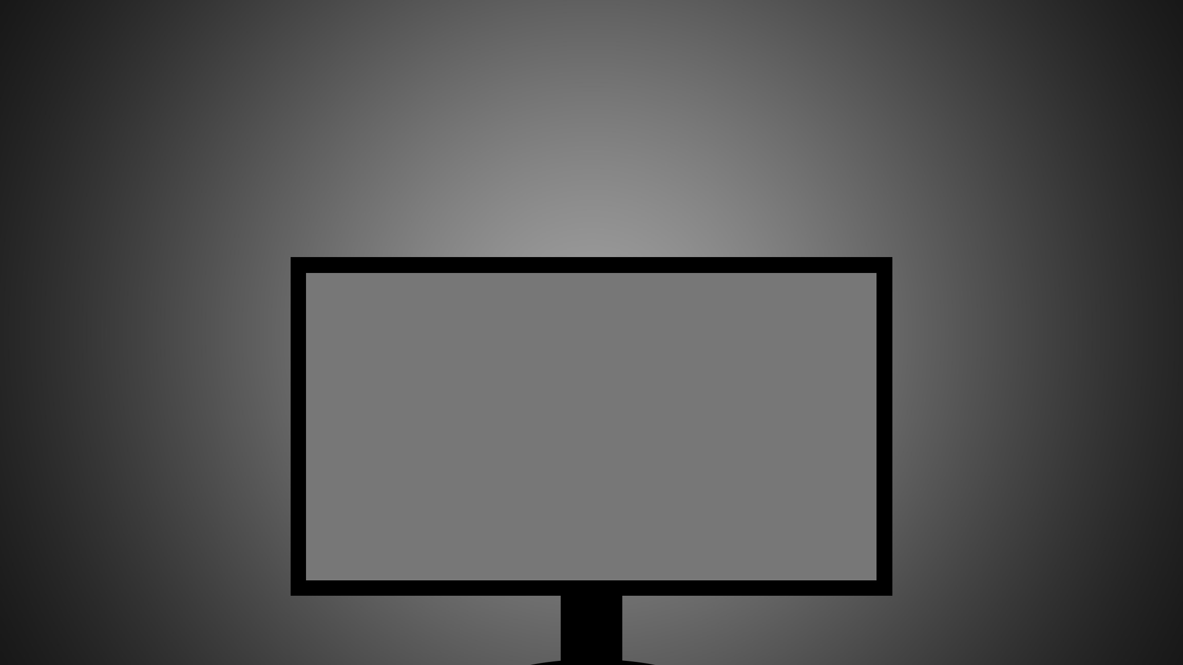
The graphic above shows a neutral gray for a gamma of 2.2, which is the standard for photography, as well as computers in general. If you enlarge it to full screen, the wall behind the monitor should be very close in brightness to the monitor screen. But above all, the wall shouldn’t be darker.
If the wall is darker than the screen, all the pictures will also be (and already are) darker than you think when viewing them on your monitor. This is clearly visible on printed photos and in thousands of forum topics titled “Why are my prints so dark?”. It absolutely does not mean that the wall has to be painted gray. Most often white is better, not gray, because with wite paint it is possible to achieve the same effect with darker lighting. A white wall can be perceived by us as white, or as black (and all shades in between) – it all depends on how much light falls on it, and we strive for neutral gray.
Once the background is properly illuminated, the perception of contrast and brightness will be neutral. Photographs viewed on prints in daylight, and displayed on other devices, will no longer appear too dark. The vast majority of people have the screen’s backlight set way too high (that is, the wall behind the monitor is darker than on the image with gray color). In that case, the monitor brightness needs to be reduced, or the lighting in the room should be increased. Most often it will be necessary to do both. How much what we see depends on the environment I have already shown. However, the following checkerboard also presents great:
The fields of A and B are identical.
I realize that it is very difficult to compare the brightness of the wall, with the brightness of the screen. Completely different characteristics of light sources, make it hard. In my opinion, the easiest way to make it easier for yourself is to turn on the camera on your phone/tablet, and position it so that the monitor and the wall are in the frame. After switching to black-and-white mode, assessing brightness becomes much easier. In addition, you can lower the exposure and if the wall is too dark, the monitor will still be slightly visible, and the wall will become a black spot, so you can immediately see the difference in brightness. Probably not ideal, after all, the camera’s sensor captures differently than we do, nevertheless the method is very helpful.
You should also definitely change the background in Photoshop to a neutral gray (Preferences > Interface > Standard Screen Mode > [Własny] and indicate #777777 as the color).

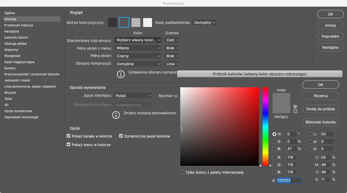
The Photoshop background then looks like this:

4. the brightness of the monitor must be in tune with the environment, but should not be too low.
That is, in order to adjust the brightness of the monitor to the environment, you cannot dim it to very low values. So you can’t use very low lighting in the room and dim the monitor to the minimum. For color-critical applications, including photography, it is assumed that a minimum of 80 nits, should be maintained. Since setting higher values can also cause complications (this time with reflections of bright elements of the apartment, in darker parts of the screen), the easiest setting for photography is just 80 cd/m2. The calibrator will indicate the appropriate value – it’s essential for photo editing (unless you have NEC monitors with Multiprofiler – in that case, everything can be set using this program, at least for first few years from the purchase of a new unit). 80 nits is the value at which our eyes have no problem distinguishing colors correctly. If the monitor is set to a lower brightness, there is a risk that dark elements will appear lighter to us than they actually are, and that color perception will be disturbed – the darker it is, the greater the discrepancy. This, too, is easy to check for yourself – just look at any multicolored object at night, with lighting in which you can barely see it. It will not be possible to name individual colors, let alone see the different shades. At that point, our vision perceives shades of gray, and dark areas appear lighter. The more light, the better the color discrimination. At 80 nits, there is no concern that we will have distorted perception.
The value of 80 nits is not universal and the only right one, but it works great for printing, and personally I think also for the Internet. If I process photos at 80 cd/m2, they look very good when viewed on a brighter monitor. A similar effect occurs when watching movies – the footage is recorded to look as good as possible in cinema conditions, but with the receiver’s brightness increased, it will appear even better… for a while. After a while, the eyes will adjust, and lowering the brightness will cause a negative effect – the image will seem poor (but only temporarily).
Another school says a separate calibration for preparing a print (80 nits), and a separate one for Internet (about 120 nits), with the same room lighting as for print. In other words, you then edit photos for the internet with a monitor that is “more eye-straining”. That’s because most people have their monitors set to a bright setting (for games and watching movies it is great). However, as I mentioned, I don’t brighten the screen because my photos then come out too dark, besides, it would simply harm my eyesight.
5. lighting must have the right parameters
The lamp must make the background behind the monitor as close as possible to the appearance of the screen itself. That is, the white of the lamp must not fall into orange, not have a green tint, etc. The standard white point in photography, as well as on the Internet, is D65. Anyway, it is almost always this value (D65), that will be the best. The light illuminating the room, therefore, must produce a whiteness similar to that of the screen. This absolutely does not mean that the lamp should be 6500K!!! Comparing light sources with different spectra in this way will NEVER work. For example, a monitor set to D65, has a whiteness similar to 5000K fluorescents, while with LEDs it will be just over 5500K, and with halogens just below 5000K.
Fortunately for us, the D65 white point also works great for print preparation, as photographic papers contain a lot of withening chemicals, so in the omnipresent UV light, we perceive them as more blue. Unfortunately, there is still a myth about the D50 for printing, fortunately, a quick glance at the D65 monitor and a sheet of photographic paper in daylight is enough to dispel any doubts. Kelvins listed next to lamps don’t really tell the whole story, because lamps with low CRI (below 95) can have different tints (like little bit green). Therefore, I will did one paragraph about specific lamp models that do not have such problems and shine neutrally.
6. Only the area in sight should be illuminated, not the entire room.
Light behind the user’s back can cause problems. The smaller the room and the brighter the walls, the more the side and back walls will be illuminated. As a result, they can reflect in the monitor, and this is unacceptable. When the lamp is moved to the back, behind the user, in addition to having to shine enough to illuminate the wall behind the monitor, it will illuminate the other walls that are not in sight much more. If these are black, that’s fine, but most people have rooms in light shades, so in bright light, will reflect in the monitor.
Problems will manifest themselves differently, depending on the type of finish of the monitor’s screen. On matte ones you won’t see reflections, for that the contrast of the whole screen will drop a lot. In glass screens like iMac (which are not used in pro monitors for photos, but are the norm in laptops), reflections will be omnipresent, and the lamp itself can cause a pronounced light reflection in some areas of the screen. Macbooks are the only ones that have glass LCD with good anti-reflection, but even he can’t manage well enough. Fortunately, for the past few years, good monitors have mainly used satin screens. This is the best option, as it combines the advantages of glass and matte finishes, but its disadvantages are kept to a minimum. As a result, the lamp does not cause a large drop in contrast, and reflections are low. Although you have to be careful not to illuminate yourself too much with the lamp, because then the user may be reflected in the dark parts of the screen (not like with glass, but still).
That’s why the lamp is best when it’s above the monitor, moved slightly toward the wall you’re looking at. That is, illuminating the wall, but not the desk and the user. If the lamp is between the monitor and the user, it can cause a decrease in contrast, and will illuminate heavily on the face, hands, clothes, keyboard, etc., which can then be reflected in the monitor. On top of that, the desk top itself will then be illuminated, which, if it is not matt black, is also likely to become a permanent part of the screen. The black surface of a pen tablet, for example, can reflect in the screen.
In summary – it’s best to have a lamp aimed at the wall behind the monitor, which doesn’t light the rest of the room at the same time. That’s why it’s a great idea to install some sort of light-blocking strip that prevents the light from reaching the user. If one walks away from the computer to a darker place for a while, there is no worry that one will perceive the image differently when one returns. Our eyesight gets used to a lighter one very quickly, while it takes much longer to get used to a dark one. This is easy to check – just reduce the power of the screen backlight for yourself for a while. It will be a long time before you begin to perceive the brightness set now as sufficient. For a long time, the image will appear too dark and lack contrast. On the other hand, if you lighten it up, getting used to it will only be a matter of several seconds. For the same reason, people who use a properly adapted workstation for the first time, because they previously had a too bright screen, will usually claim that the monitor is now too dim. On the other hand, if after a few days, they try to go back to the old settings, they will not be able to understand how they could work for years with a monitor that almost literally burned out their eyes. The current setting will no longer seem too dark at all.
Fighting screen glare
When setting up a light, it’s always a good idea to project a black board across the screen and look to see if anything is reflected in it. Anyway, you can also do it right now:

You don’t check the reflections on a monitor that is turned off, because then its backlight is off, and in LCDs it also affects blacks. Depending on the position of the lamp, different elements will be reflected. I, for years, in each apartment, first placed the lamp on a tripod (usually on a boom) and chose the right position, and only later mounted permanently in the place that was best (and it happened that on this tripod stayed for a long time, but it did not look beautiful :)).
Monitor hoods are put on the monitor to cancel out glare, but when the glare comes not just from the immediate surroundings of the workstation, but from across the room (e.g., from behind the user’s back), the hood can’t handle it either. In addition, the hood should be used only as a last resort, when no other way can cancel out the reflections. Unfortunetly in many office spaces, the hood is the only way.
Very bright computer room, or less so?
The retouching room can be illuminated in two basic ways:
1. The wall behind the monitor painted with white paint + lighting, illuminating the desk sufficiently for retouching, but too dimly that the prints viewed in this light can be compared with the monitor screen (because they will be too dark by the fact that the light is not directed directly at them, but at the wall behind the monitor). Such lighting is not very powerful.
2. A wall behind the monitor painted with gray paint + significantly stronger lighting, also illuminating the desk. This allows you to compare prints with the monitor screen, because the white of a piece of paper next to the monitor, will be the same as the white of the screen itself (and the same with colors). This solution has many more disadvantages than advantages (this one is only one – the mentioned proofing prints).
In both cases, the wall behind the monitor will look the same to us. That is, just like a neutral gray, displayed on the screen. Simply put, with gray paint, a stronger light will be used to achieve the same effect than with white paint. In this way, one lamp can also illuminate the print on the desk sufficiently. Although the workspace will be less bright than in the first case, my experience is that almost everyone has it too dark anyway.
The vast majority of people do not need to compare the photo on the monitor with the printed photos at all, and if they do, it is a much better idea to illuminate the workstation with the first way and put an additional lamp on the desk, created precisely for proofing prints under it.
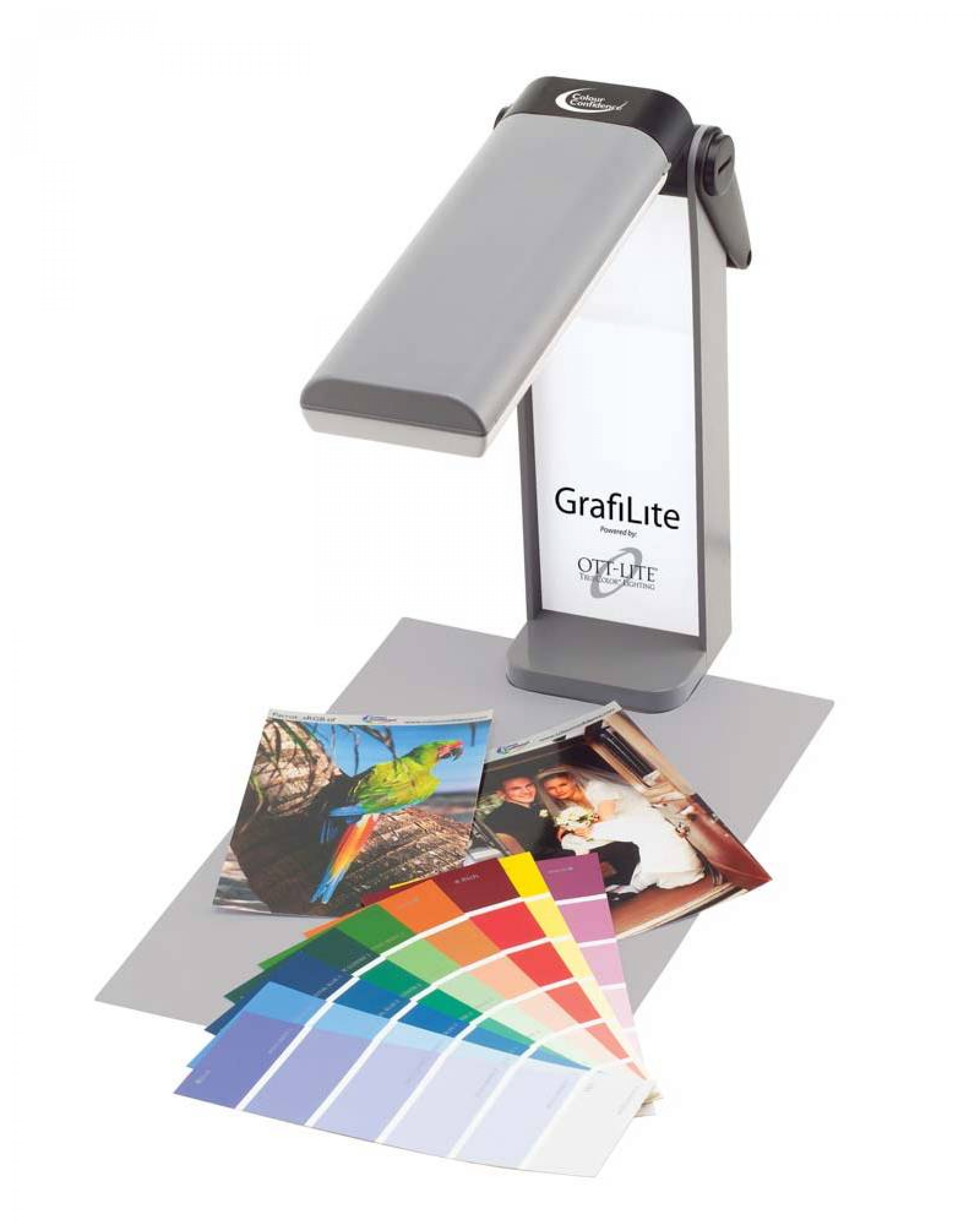
You can also use a special device on your wall made for proofing even larger prints, although this is a much higher cost. This is why some people choose to compare prints under the same lighting as the retouching itself. Unfortunately, since we’re also lighting the desk, we’re also lighting the keyboard and all the other accessories, as well as ourselves, and that means a gigantically increased chance of reflections in the monitor or a decrease in contrast, as well as many times more strongly lit walls all around (which in most rooms will translate into the same thing again – even more chances of reflections in the screen). In the times of matte displays, the drawbacks of such a solution were not immediately apparent, especially since photos require very little contrast, so many people ignored the decrease in contrast. Worse if the computer was also used, for example, for video editing – there the contrast is very important. In the era of satin displays, no one is likely to miss their reflection on the screen, so I strongly advise against illuminating your face with a lamp.
Brighter lighting (retouching + proofing prints in the same light)
When you don’t want to look at the prints, you can move on to the next point in this article. However, if someone nevertheless absolutely wants to compare his prints with the monitor screen, in the same light as for retouching (instead of by a separate dedicated lamp placed on the desk), then he has no choice – he must have a strong light over the computer. Strong enough so that the white of the paper matches the brightness of white on the monitor. That is, you need to project a white board on a screen and compare it with photo-paper. With this kind of light, the wall behind the monitor (if it is painted white and the lamp is not far from it), will be much brighter than the gray you want, so you need to paint it gray, or cover the lamp in such a way that less light reaches the wall. In the case of linear fluorescent lamps in a louvered fixture, adequate brightness is usually achieved only at approx. 70W, that is, with 2 long 120 cm fluorescent lamps, or 4 short ones. In comparison: wanting to have lighting just for retouching, at most half of this power is sufficient, and often much less.
However, in order to correctly evaluate the colors in a photo, it is not enough to have the right brightness… You need to have a light with a high enough RA/CRI parameter. For example, under ordinary fluorescent lamps, colors will have less saturation on paper than on a monitor. Sun has a RA of 100, and normal fluorescent lights about 80. 70-80. That’s why our skin appears paler in such light than it does outside. So to compare photographs, you should use not only sufficiently bright light, but also very good quality. Otherwise, it doesn’t make any sense to compare prints with the screen.
However, answer yourself honestly – if you have a decent monitor, when was the last time you had the need to compare prints with the screen? In graphics, this has more justification, while in photography, for many people, the need arises from a poorly prepared room (it then turns out that the prints are too dark, etc., and corrections are made on that basis) or by monitors unsuitable for photo postprocessing. Of course, there are also people who need to make proofs, but they are a definite minority.
Weaker illumination (retouching only)
Without comparing prints with screen, it completely misses the point to aim for the same white brightness on the sheet of paper and on the screen. The focus should be on getting the right gray behind the screen and that’s it. If this gray is appropriate, we will see everything on the monitor correctly, no matter how strong the light is obtained. The wall should ideally then be painted with white paint, not gray. With the right light, this will give the gray we want (probably in the case of a linear fluorescent lamp, it will be about 20-30W maximum, instead of approx. 70W necessary to illuminate the print, but it also depends on the location of the lamp etc). So as a reminder – all you need to do is to make sure that the background behind the monitor is free of color casts and has the following brightness:
With less light in the room, there is much less chance that the walls will reflect in the screen causing the problems mentioned earlier. If the lamp does not shine directly on the desk and on the user, they will not be reflected in the screen (the user, even though he or she is dressed in black, the hands and face will probably be uncovered, and the skin is reflected very readily in the screen). With bright light, reflections in many monitors cannot be avoided at all, and with weaker light it is much easier.
Such a solution shows its advantages even more in small rooms, where reflections are much easier to occur than in spacious workrooms. A bright wall right behind you in strong light will be a nuisance, while in weaker light it may not cause problems at all.
Lamp on the ceiling or behind the monitor
Personally, I am a firm believer in ceiling-mounted lighting rather than behind the monitor. Admittedly, I have been using both solutions for a long time, and I can switch between them at any time, but I acutely use them for other purposes. I always choose a ceiling light for retouching.
If one were to look at a computer workstation with light from behind the screen, the standard situation is with a sizable glow of light at the monitor itself and darkness just a little further away. Since light decreases with the square of the distance, it can hardly be otherwise. You can indeed soften the light and try to partially cover the lamp in places where it directly illuminates the wall, in order to equalize the brightness with the more distant areas, but it requires a lot of tinkering and based on photos from the internet, I assume that hardly anyone does this. Quite a few people accept light only in the immediate vicinity of the screen, because this is still a much better situation than complete darkness, and it is much easier to judge then the correct contrast and brightness than when this light was absent. For me, the comfort of working in such conditions is significantly lower compared to a situation where the entire workspace is evenly lit because I constantly feel like I’m working at night instead of during the day. However, I do realize that I would eventually get used to it. Anyway, I used to only work at night, with terrible lighting….
Never suggest photos of posts that have lighting behind the monitor, and in the photo you can see almost nothing beyond the monitor, or only a few tens of centimeters on the sides of the screen. Sometimes you can already see a clear glow of light, so a while further on it will be several times darker. Looking at the monitor, we see an area many times larger. It should be clear to the photographer that the light weakens in proportion to the square of the distance.
If we are to do lighting well, we need to cover an area that corresponds to the minimum viewing angle. With a ceiling lamp this is easier to achieve, although if the monitor is very close to the wall, even then it will be difficult to get the right conditions, as the lamp will either be against the wall itself or above the user, unnecessarily illuminating the keyboard, face and anything else that is then reflected in the screen
Ideally, the monitor should not be close to the wall itself, but slightly away from it. Then the light mounted near the workstation, will be further from the wall, so it will spread much more evenly, without causing problems. On large desks, the monitor is standardly placed a few tens of centimeters away from the wall, but in the smaller ones, it often has to be placed at the very end. Then it will be much easier to achieve even lighting if the desk is slightly offset from the wall. Even more so when the light will be from behind the monitor and not from the ceiling.
With overhead lighting, it is easier in high rooms than in low ones. The lamp is then far out of sight, and by the distance from the desk, the light will spread very evenly. In low rooms, you need to be careful that the lamp does not shine into the eyes and into the user in general. However, as I mentioned before, you can then mount some kind of trim next to the lamp (at a 90-degree angle to the ceiling) to cut off some of the light directed toward you – this enormously reduces potential reflections in the screen.
Types of lamps
We want a light that produces a whiteness similar to that displayed by the monitor. At the moment I would definitely go for LEDs (and I did) with variable power control, but there are more options.
Linear fluorescent lamp
For years, this has been one of the best options and simplest. This is not surprising, since we already have a relatively soft light at the start, which evenly illuminates a large area. Thanks to the louvered fixture, such a fluorescent lamp does not spread light over the entire room and partially naturally cuts off the light that would go straight at the user without it.

Unfortunately, few people want to have such a lamp in an apartment – they are definitely more common in offices. There are also more designer-like models, but they are not as popular and not as affordable. In this type of lamp two elongated fluorescent tubes are installed, with which it is easy to evenly illuminate a large area, while for retouching already one 120 cm should be enough. There are also square lamps for four shorter fluorescent tubes, but I strongly recommend the two-light ones, which are long and narrow. Regardless of the housing, the reflector inside must not be colored (gold and blue happen, fortunately, silver is by far the most common).
There are also very simple housings for fluorescent lamps, which do not restrict light at all, only provide power and nothing more:
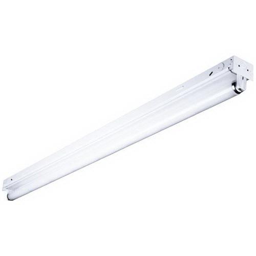
This is not a bad option, but then the light will go to all the walls, if this is not prevented by some additional obstacle, mounted next to the lamp (in my case, this was done, as usual, heavily makeshift – with the help of some plastic sheet, bought from an office supply store).
Standard fluorescent lamps have a low CRI and produce unpleasant color casts. However, there are also strictly photographic models, having high CRI and appropriate temperature. They are numbered 950, which is RA over 90 and 5000K. Worthy of recommendation are Osram’s Lumilux Proof series of fluorescent lamps, and Phillips’ Graphica series – they are designed precisely for color-critical applications and the prices are not very high. The disadvantage of linear fluorescent lamps and those I will describe in a moment is the lack of brightness adjustment in standard fixtures.
E27 fluorescent lamps
I mention them only out of necessity, because few people want to install linear fluorescent lamps in the apartment, and those screwed in place of a regular bulb do not bother anyone and are usually the first choice. Unfortunately, fluorescent lamps on the E27 thread do not come in the form with high RA (supposedly, photographic ones have 90, but 90 is not 98, but they very much change their parameters over time). As a result, it is difficult to avoid color casts. it would be better to buy several low-power fluorescent lamps (usually the strongest ones have a little over 20W), instead of one large one (which can be as much as 250W). The small ones can be bought in any store, the large ones only in those with photo and film equipment. Unfortunately, the problem is finding a version that won’t emit light that is too warm or too cool, and ultimately, we will most likely still have color casts.
Small fluorescent lamps can be arranged in several lamps, so you get a much softer and more even light. On the other hand, if there is no choice and you need to install several fluorescent lamps in one socket, you can simply purchase a socket splitter that will convert one socket into several (enough for 2 or 4 sockets, but I’ve even seen ones with six).
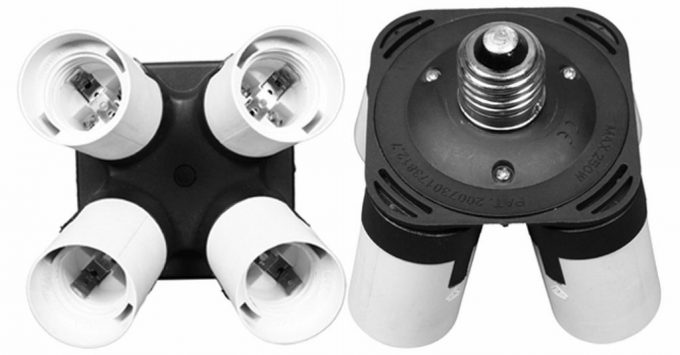
An example splitter, available for purchase here. Today we have definitely better options, so I would avoid such fluorescent lamps and choose, for example, the following. LED bulb, as long as it’s the right one….
LED bulbs
Most LED bulbs are a terrible mess. Fortunately, there are already good LED bulbs, as well as whole LED lamps, you just need to know the specific models. If one wants the bulb itself, there is not much choice and those sold under the Yuji brand are the best option. These are diodes so good that they could be used as reference lighting for viewing prints. Unfortunately, they emit light quite pointwise, are not cheap, and do not have any smart features themselves, so you need to take care of any brightness adjustment on your own. If you want to evenly illuminate a wall, one unit is not enough.
LED video lights
You can also use LED lights, created for video shooting. If we do not look among the biggest crap, many models around 5600K will have the appropriate white balance, and even very good color reproduction. There is no point in buying lamps with mixed LEDs (3000K + 5600K), we only need 5600K or 5500K. Unfortunately, the prices are not encouraging, plus many models are actively cooled, and the fan noise can be disturbing. For example, the first time I used a film lamp for retouching, besides the air conditioning, it was the loudest element in the room. During retouching, my computer was almost silent, so it only made more noise than the lighting while rendering video. When I later used the lamp again, this time to illuminate the wall and my face at the same time, for sound-to-image recordings, the noise of its fan actually made it impossible to get clear audio, so I had another reason to change the lighting.
As with fluorescent lamps, the best LED lamps will be long, and narrow. That is, the so-called. LED light bars. There is one model that stands out for its very low price and exactly the light we need – the YongNuo YN360S 5600K, costing just over 40 USD. In addition, it is passively cooled, so it does not generate any extra noise. It’s also thin enough that you could even slip it into a louvered fixture if you don’t have any idea how to mount it. It is also perfect for placing behind the screen, and I currently use them for lighting the entire room and to get light from behind the monitor during live recordings or even regular video calls. However, I made a whole separate article about this lamp and there is much more information in it – link. Anyway, with a rectangular lamp it is harder to illuminate a room as well as with a light-bar.
Halogen
Decent lighting can be achieved with halogens, which, unfortunately, have significant disadvantages: they heat up a lot, need a lot of energy, require a very stable voltage to hold the parameters, on top of that they add up to more expensive than other solutions. Yet with their high CRI, they are suitable for proofing prints. I’m not elaborating here, because I’m having a hard time finding a reason why anyone would go into such a light these days.
My experience, that is, how not to setup a light in computer room
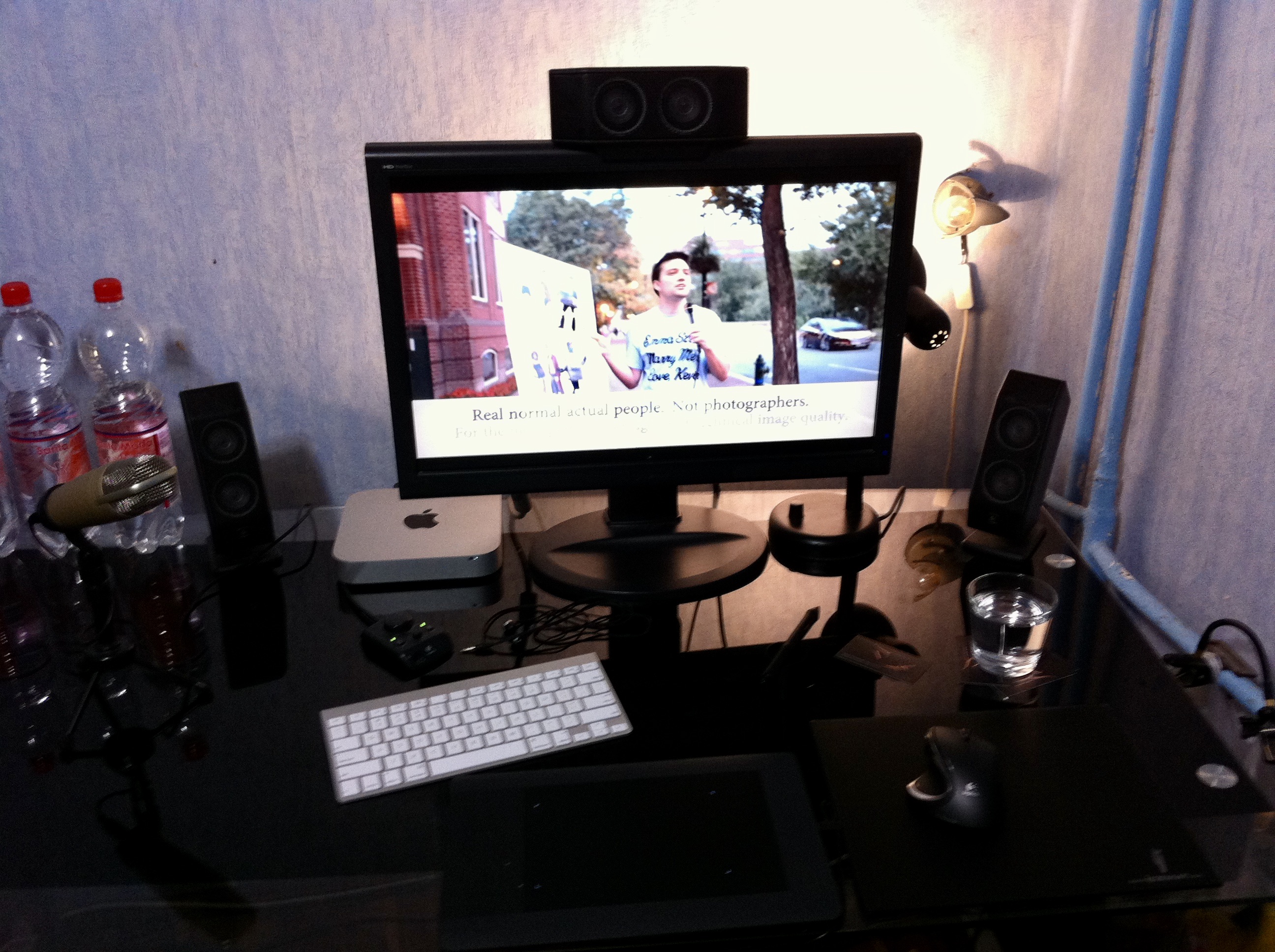
For the purposes of this article, I dug up some older photos, but these are some random shots that, for the most part, were never meant to be shown. Also the place with the computer show poorly and are of terrible quality, but I guess it’s better than nothing. For a long time, I lacked experience in workplace lighting, so it was a process of trial and error, and a lot of learning from my own mistakes. It was only much later that I began discussing this topic with experts. Fortunately, I never cared about the aesthetics of the lamps, which made it possible to do a lot of experimentation with different lights, spaced on tripods, and see how moving the lamp a little forward or backward would affect the final result. However, this was a later stage. At first I worked without any concern for lighting. This caused gigantic problems, only that I didn’t realize it at the time. Next, a desk lamp landed behind the monitor – without thinking about its color, the background color, brightness, etc. With the lamp, it was much better than without it, but still far from ideal. Of course, at the time I thought it was great.

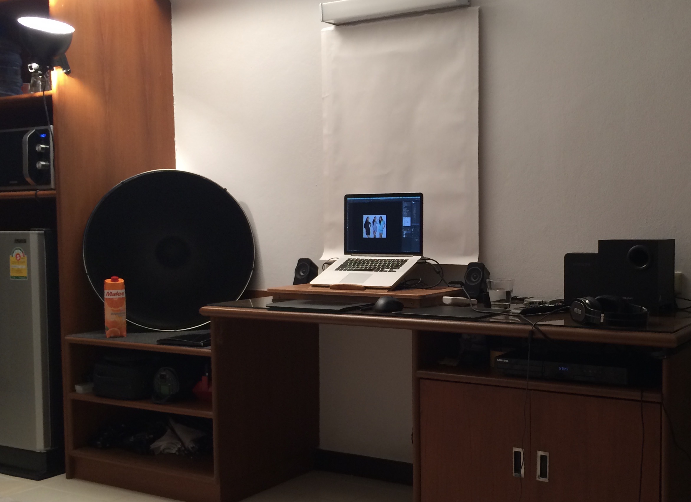
Later, for several years, I worked with a wall covered in white paper (that worked well) and photographic fluorescent lamps placed on the ceiling behind my back (that was not as good). They were mounted in round fixtures and shone all around, including on the white cabinet that was behind me. This resulted in a drop in contrast, and since this was in the days of matte screens, the contrast dropped dramatically and even on an S-PVA screen blacks ceased to exist. At the very beginning I didn’t even realize it. I simply thought that in brighter light, that’s just how it is. When I figured out what was going on (I think it was only when I put a monitor with a satin screen next to my older LCD), I used a black “sun reflector” to cover the furniture that reflected the most. It helped a lot, although if I had mounted the lamps above the workstation, instead of moved to the back, it would have been even much better.

Unfortunately, I never managed to get the lighting in that room in order, but compared to what I had before, it was still much better, and it was possible to comfortably do retouching there. You can’t see it in the photo, but the lamps were spaced very wide, so the whole wall was lit evenly.
Immediately after the move, I took a step back in lighting, because I needed a temporary solution. I knew that in a few months I would change my place again and I wasn’t keen on experimenting, so I used a solution that I had been using for years when urgent retouching had to be done in hotels. That is, I used a halogen in a studio lamp, placed on a tripod. It was pointed between the ceiling and the wall behind the monitor. I didn’t want to use studio equipment in such a way, because the entire lamp had to be on and the cooling system was running at full speed. Therefore, I quickly bought a mount with thread and it was to it that I screwed the halogen. I also attached a reflector from the same studio light there. A little later, with the computer in a different place, the furniture at the desk was arranged in such a way that I was able to attach the light to it with a clip and get a similar final effect as before from the boom. It’s embarrassing to publish it, but that’s how I managed:
Since it was a halogen, the whole thing heated so much that after few months almost all melted. Not only did it function like a heater, which wasn’t ideal with 40-degree temperatures outside the window, but it also consumed more power than a projector. Later, on another thread, I mounted a photographic fluorescent lamp, instead of a halogen.
A little later it was time to do some decent lighting, but in the meantime I realized again the importance of what is behind the user’s back. The white wall was far enough away and poorly lit that it didn’t cause any problems, but the anti-glare frame with a photo on the same wall reflected so strongly in my Mac screen, that at first I covered it up, and then I replaced the anti-glare frame with a picture without glass.
The next step was to buy a 120-centimeter raster fixture. Unfortunately, the desk was very short and permanently attached to the wall, so the lamp was both very close to me and the wall behind the monitor. That’s why I cut out some studio backgrounds and glued them to the lamp so that the light illuminating me would be minimized as much as possible.
The raster lamp stayed with me for many years and worked very well. It was easy to illuminate a large area evenly with it, and to this day I believe that mankind has not invented any better fixture. Then, as an experiment, I inserted a gray studio background behind the screen, but quickly reverted back to white.
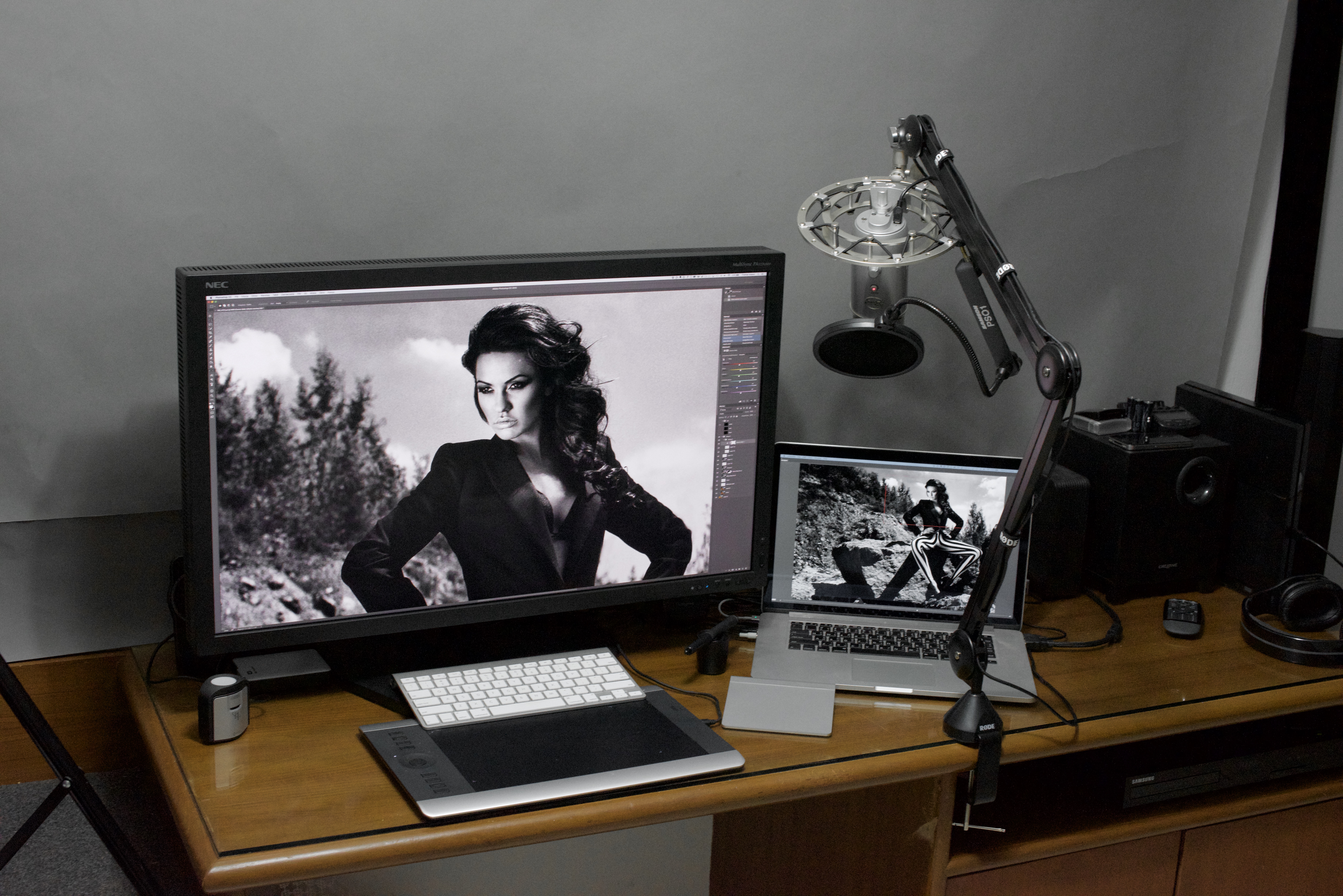
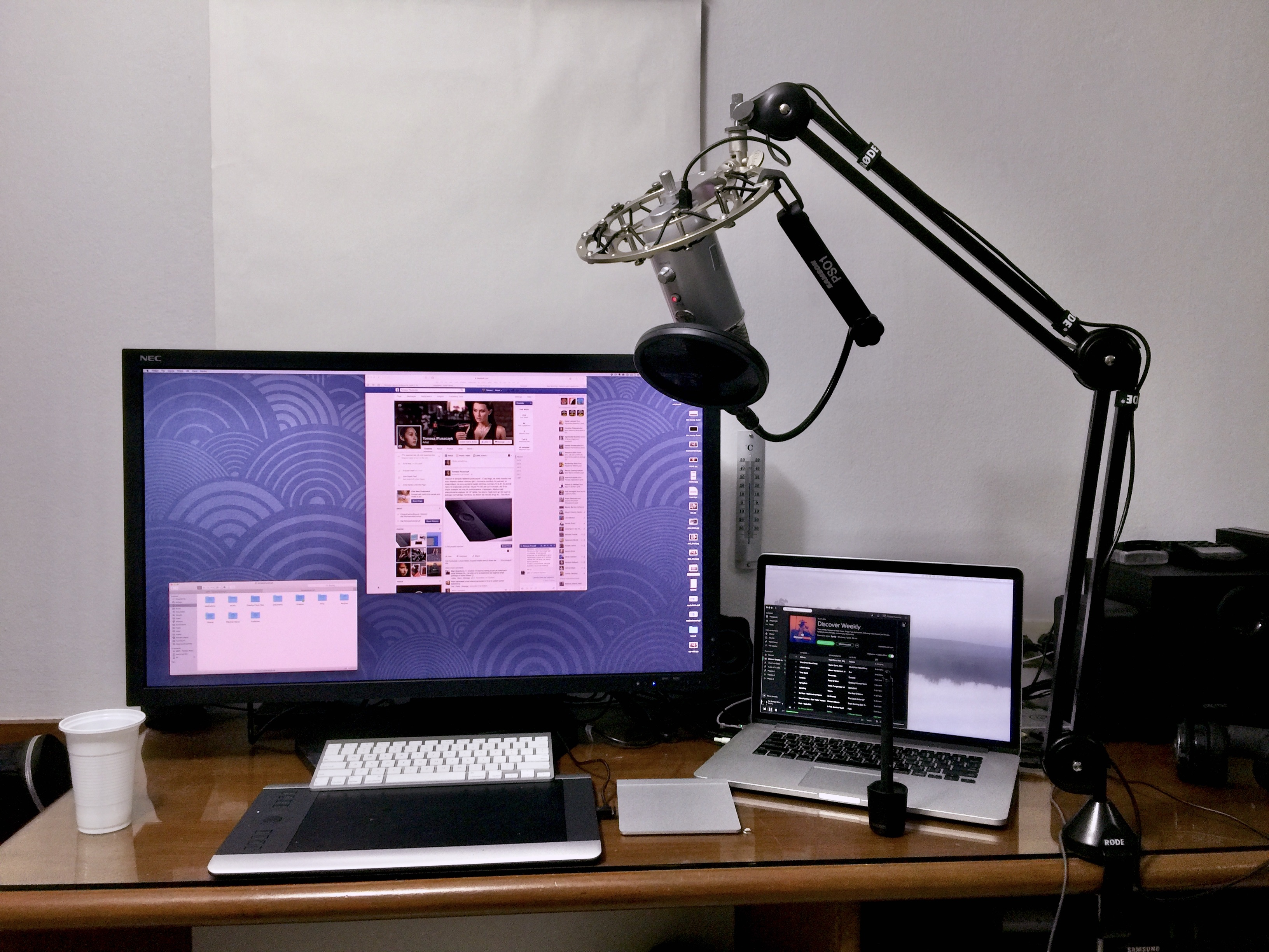
After moving to my current apartment, I also used a louvered fixture. However, in addition to retouching, I also use the computer for recordings that include audio, and I found that I needed to soundproof the room decently. This required, among other things. the very irregular shape of the wall behind the monitor, which would make a lot of shadows with any lamp mounted close by. Working in such conditions was uncomfortable for me, so I could either cover the white wall with sound transparent fabric (which would allow the light from the lamp to spread well again, and the sound would still be muted), or I could mount the lamp behind my back. I conducted tests on how much of a negative impact it would have on the contrast, and it turned out that thanks to the satin screen, it could be great… if I made the wall behind my back black. It was on my mind anyway, so I didn’t delay for long. So instead of a raster fixture, I only needed a simple holder for the fluorescent tube, but again, I directed the light with various additional elements. At the same time, mounting the lamp several inches behind my back did not work at all – it illuminated then strongly my hands, blond hair, and everytime I moved my head, something shimmered in the frames of my glasses. The lamp placed farther away meant that the light was already falling on me from behind, in addition, I was casting a shadow on my hands, keyboard and pen tablet, so it stayed that way. Later I replaced the fluorescent tube with LED bars and I still have it today.
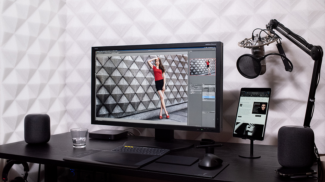
I will add that several times I had a desk in a niche (even now I have it like that, as seen in the above photo At that time, the lamp directly above the screen illuminated everything in front of me very good, but outside the recess there was darkness, which I always noticed out of the corner of my eye. This has never suited me, and I have always then used an additional light to illuminate these places (well, unless, as at the moment – the light is from behind, then there is no need).
In the past, I focused on setting the same white brightness on the screen as on its surroundings (the white paper sheet test) and then adjusting the gray behind the monitor. On matte LCDs, the disadvantages of such a solution were not apparent at first glance. But I haven’t used matte for years, and since I only do retouching in this light, in my case very bright light, with a gray painted wall, is just an unnecessary problem (reflections). So, for me and for almost everyone else, a white wall and choosing the right lighting to match it (instead of choosing lighting to match the paper and painting the wall grey) is the best option.
My work station on video (polish only)
Summary
Photos are best processed in an artificially lit room, because sunlight keeps changing constantly. A monitor calibrated to 80 nits and a neutral, 50%, gray behind the screen are very good conditions when retouching photos. The screen doesn’t strain the eyes or isn’t too dimm, and the user can see colors correctly.
Of course, it is also very important to have a monitor that is suitable for photo editing, I wrote about this in a separate article(link). Photos of people are particularly demanding of the screen – even a minimal difference in skin tone is immediately apparent, while a slightly different shade of the body of a car, clouds or trees, is unlikely to be incorrect for us, at most just different than in reality. Poor quality monitors are unevenly backlit, have a different white point in each part of the screen, colors are not displayed correctly, and black and white photos get strange hues.
F.A.Q.
What color should the wall behind the monitor be?
With a white wall is the easiest. However, if you need to view prints in the same lighting as the retouching is done, you will need a gray-painted wall, or you will need to manipulate the lamp so that less light falls on the desk than on the white wall. Regardless of the color of the paint, to the user the wall will look the same, because the light will be of different brightness.
Should I buy a monitor hood?
Only if you have already done absolutely everything you can to get rid of the glares, and they are still there. If you put the hood on, just because it came with the monitor, then take it off (many people do this because they think it is more “professional”). If you use it instead of trying to upgrade the room lighting, then you’re doing it wrong. The hood is a last resort.
What color temperature should the light in the retouching room be?
Such that its white would be close to the white of the monitor. For fluorescent lamps it will be 5000K, for LEDs ~5600K. Definitely do not use 6500K lights!
To what parameters to calibrate a monitor for photo editing?
The standard in photography, which will be suitable for almost all people, is a white point of D65, gamma of 2.2, brightness of 80 nits (this one depends on the brightness of the environment).
Eizo sells a monitor-mounted lamp, is there any point in buying one for photo editing?
This is a lamp with light suitable for medical monitors, meaning it has light temperature much colder than a monitor set to the D65 white point (so the screen with that lamp will appear much warmer than it should). You can try using an orange filter on the lamp to warm up the light, but it’s easier to just buy a different lamp with parameters suitable for photography, rather than medicine.
Will an ordinary fluorescent lamp from a random store be okay for retouching?
The chances of achieving this are minimal – color casts are common in standard fluorescent bulbs, so getting a white balance similar to the monitor is almost impossible. In addition, such fluorescent lamps are almost always 4000K or 6500K, not 5000K. The difference between 4000 and 5000 is immediately apparent – the screen appears too blue in such light.
Will smart bulbs, with fully adjustable colors, be okay?
I have never done tests on them in terms of their suitability for retouching. In my home office for retouching, I use different lighting because it’s much easier to achieve good results with lamps that already have a linear shape and high CRI. Even if it were possible to achieve the right color scheme, in order to evenly illuminate the wall with incandescent bulbs with an E27 thread, you need several pieces (and a minimum of two, softened with some kind of diffusion layer).
After publishing black and white photos, I feel that they are too gray-black
If I want intense white in BW, I switch my background in Photoshop from gray to white for a moment to have a reference point. If the photo then seems too “gray-white” to me, I then increase its brightness and restore the gray background in PS.
On my screen I can’t see the difference between total black and shades minimally lighter, what to do?
Nothing. At a gamma of 2.2, there should be no difference. Sometimes monitors are factory set to sRGB gamma (not to be confused with sRGB gamut), which is non-linear – it has an approx. 1 in the shadows and 2.4 in the brighter areas (which may be useful, for example, in games, but it doesn’t comply with the standard that should be followed). If you want to see any detail when processing in gamma 2.2, just add a layer to increase the exposure for a moment, while normally you see the correct image.
I have a computer desk in an alcove, for this there is a cabinet above the monitor, how to light it?
Lighting behind the monitor or under the cabinet, but in the latter case, it’s essential to use some sort of strip to prevent it from shining in the user’s eyes. In both situations, a significant space in sight will still be unlit. Therefore, it would be useful to have an additional light on the ceiling to fill this darkness.
Can glasses with a blue light filter be used for processing?
No. Besides, using them for anything on a computer makes little sense, because every monitor has RGB adjustment, so you can limit the blue light as much as you want. For that, there are tools like Flux, or even macOS’s built-in Night Shift.
If I do not yet have a calibrated screen, is there any point in dealing with the lighting in computer room?
Yes. At most, after calibration, the lamp power will be adjusted.
What to attach the lamps behind the monitor with?
There are plenty of ways to do this, and something different will work for each monitor because they have a different design. On the “leg” connecting the monitor to the base, you can use Velcro or attach some tiny brackets with double-sided tape. Under no circumstances should the monitor’s vents be covered.


