Color management - how to edit photos: color spaces and software
Color management is fundamental to digital photography, but knowledge of the subject is surprisingly poor. Unfortunately, professional photographers, and even people who call themselves retouchers, often have no idea which color spaces they are working in or what the consequences are.
There will be no technical babble in my post because I probably would not understand half of it myself. I will try to explain everything in a way that gives everyone something useful. People I have trained in photo retouching already know quite a lot of what follows, but I recommend that they read the whole thing too.
Update: I covered color management in far greater depth in a newer post titled "Color management in digital applications - a complete guide".
This post used to be part of my article about preparing a workstation for photo editing, but they are now two separate posts.
The RGB model and color spaces
When you press the shutter button on a camera, zeros and ones are saved to the RAW files. They are not defined by any color space, so the one you set in the camera does not matter. That option applies only to JPEG files. To open them in Photoshop, for example, you need to "develop" them, which means turning the raw data into an image and, of course, choosing a color space:

Adobe Camera RAW: the area highlighted in red is where we define the space and bit depth.
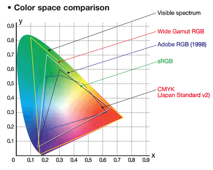
We edit photos using the RGB model, in which a color consists of three components: red, green, and blue. Other colors are produced by combining these primary colors. This is also how monitors display an image. It is a theoretical model, and the way it reproduces colors may vary by device. One device will have a greater tonal range, while another will have a smaller one and therefore be unable to reproduce the more saturated colors. When opening a photo for editing, you need to choose one of the three most popular spaces: sRGB, AdobeRGB, or ProPhoto RGB. The first, sRGB, is fairly modest. It does not contain colors as intense as the other spaces, so some photos will clearly suffer, mainly in greens and cyans. It is used on the Internet. With some simplification, you could also say that minilabs use it, although they actually have their own color spaces, next to which even sRGB seems large. That is why beautiful, vivid green grass comes out looking somewhat "dirty" in a minilab print.
We live in a world where people spend tens of thousands of zlotys on photography equipment and then send their photos to a minilab, which greatly reduces their tonal range, loses detail, adds various color casts, especially noticeable in black-and-white photos, and makes it harder to get photographs that match what is visible on the screen. Making photo prints this way is standard practice even among professional photographers, yet it is completely illogical. The final result would be much better from an inferior lens with the photo properly printed than from a more expensive lens followed by a minilab print.
Printers are no longer as expensive as they once were, and the cost of printing does not have to be higher than at a minilab. The difference in quality, however, is enormous. You can also have photos printed at a lab instead of exposed as photographic prints, so you do not need your own printer. Printers there are generally used for formats a little larger than standard album photos.
Ordinary monitors display a color space close to sRGB. We call them standard-gamut or narrow-gamut displays. Wide-gamut monitors, on the other hand, are designed for photography. They can show much more saturated colors and display a photo as it will look in a good print. Photos intended for such prints are edited in the AdobeRGB color space. It contains practically all of sRGB and quite a lot more, so printed images can have better quality and greater color saturation. Even the cheapest inkjet printer offers a greater tonal range than a minilab, so you do not need some incredibly complex technology to make use of AdobeRGB.
ProPhoto RGB is an even larger space than AdobeRGB. Monitors cannot display all of its colors, and the human eye cannot see some of them either. These are the so-called Sci-fi colors, defined mathematically and probably visible to some insects, for example, but not to humans. However, it also contains colors absent from the spaces mentioned earlier that the human eye can see. Using ProPhoto RGB is therefore not pointless, but you also need something capable of printing it later.
To sum up, we work on a wide-gamut monitor and edit photos in AdobeRGB, or ProPhoto if someone needs it, which I do not. This allows them to be converted to sRGB or CMYK without a problem. It does not work in the other direction. We will lose colors, and CMYK extends so far beyond sRGB that the conversion gives poor results. If someone has a narrow-gamut monitor, I find it hard to say conclusively which space they should choose. If they use AdobeRGB, they will not see the brighter colors on the screen anyway, only in the print, but at least they will have a straightforward conversion to CMYK if needed. It is worth knowing, however, that conversion from RGB to CMYK is always lossy. Many RGB colors have no CMYK equivalents.
Color management
Both the operating system and applications can manage color, but they do not have to. Mac owners are in an incomparably better position here. OS X provides full color management, and the user does not need to worry about anything. On Windows, however, it is a disaster...
Windows has pretended to manage color since version 7, but it does so whenever and however it feels like it, and in a badly broken way. As a rule, you have to assume that color management does not exist there. What exactly is color management? I will explain in a moment.
For now, let us generalize and say that an application with color management displays colors correctly. I probably do not need to explain how important that is for photos. Every photograph has an assigned ICC profile. If a file published online does not have one, the photographer messed up and should assign it.
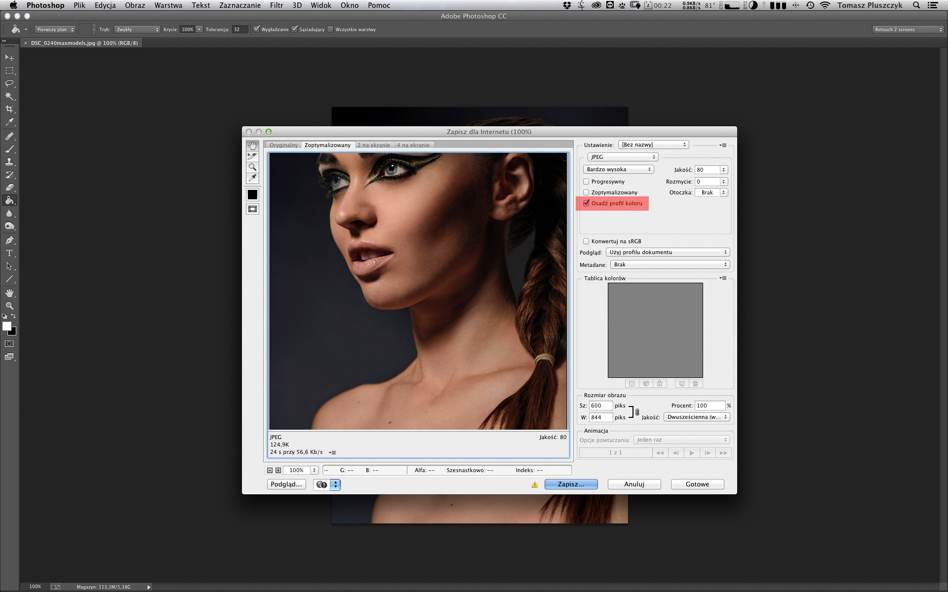
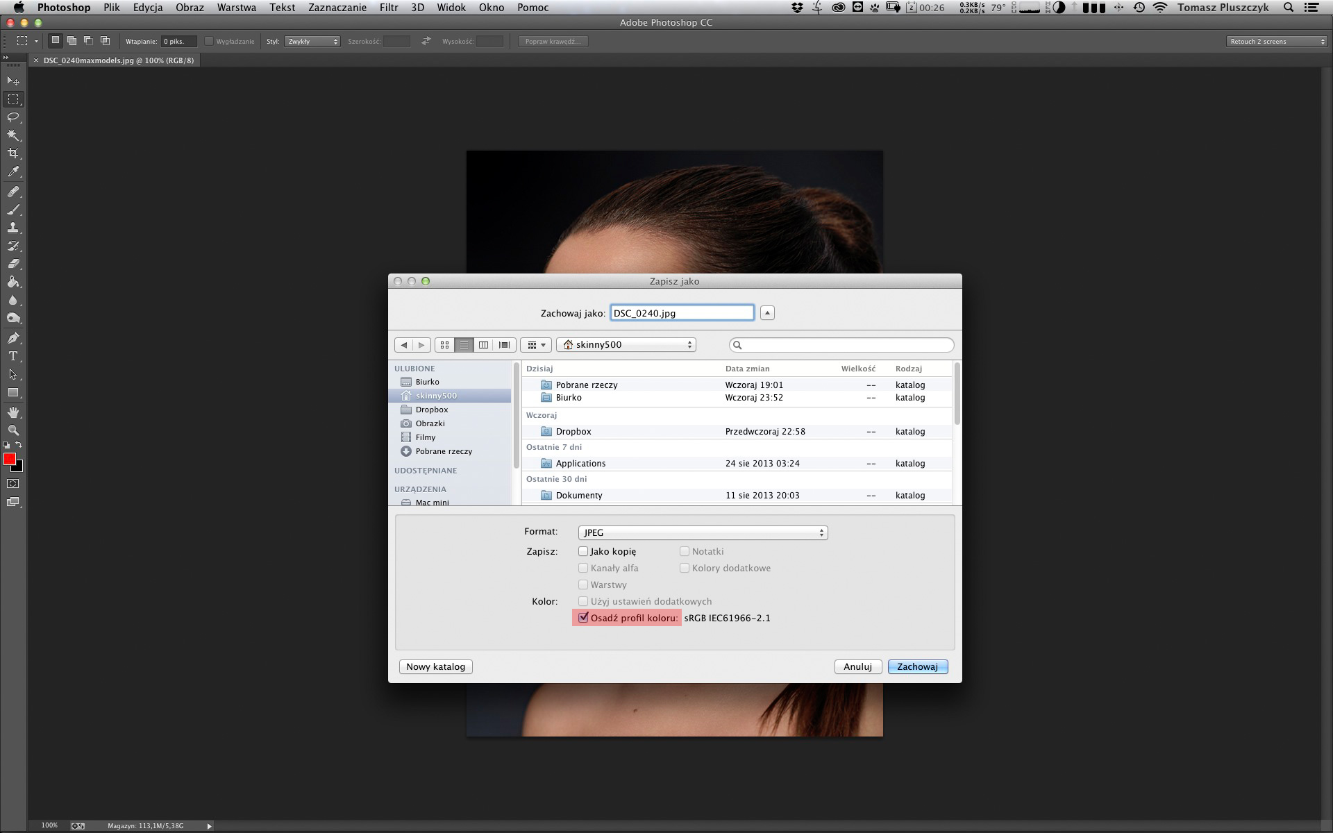
The option highlighted in red must be selected.
The profile embedded in a photo tells the software which color space should be used to display the file, such as sRGB. Without a profile, the photo may be "stretched" across the monitor's full gamut. It will then appear more saturated. We will see colors that are not present in the photo and should not be there. The difference is especially visible on wide-gamut monitors. Trees, grass, and other green elements stand out most because they almost begin to glow. People's skin changes considerably too. It takes on a red cast and becomes far too bright. The same happens in applications without color management. They treat every photograph as if it had no ICC profile assigned. The problem is that Windows tends to display almost every photo this way, even photographs with an assigned profile. What is more, colors differ between a photo shown full screen and in a window. I mean the operating system itself here. Photoshop displays it correctly because it manages color.

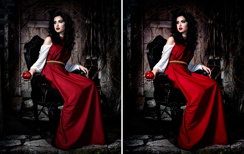
Above, we see the same photo displayed correctly by an application that manages color and incorrectly by software that ignores the ICC profile.
If that were the only problem, it would not be too bad. You could simply replace the Windows system viewer with an application that manages color and ignore the colors of the thumbnails. As a curiosity, thumbnails have different colors from open photos in Windows.
Unfortunately, that is only the beginning. It gets worse. If you have several monitors, and two screens are almost essential for photography in many cases, you calibrate each one separately. That is logical. The problem is that Windows cannot switch profiles on the fly. If I open Photoshop on the first monitor and then drag it to the second, the colors are still displayed using the profile from the previous monitor. This situation is absurd to an OS X user, who has no problems with it at all. You can even stretch Photoshop across several displays, and the proper profile associated with each screen will work on every part of the application. On Windows, Photoshop will show the correct colors on only one screen.
Unfortunately, that is still not the end of Windows' limitations. The system also cannot load all settings, so you need some application to correct things such as an incorrect gamma. The calibration application handles that. Software bundled with graphics card drivers can cause problems as well, so make sure it does not change any settings related to the displayed image.
I will leave the choice of operating system to you. You can work on either one. The "only" difference is that on Windows you need to learn at least the basics of maintaining the color management system. I already wrote about it in one of my earlier articles, where I described the differences between the systems in more detail.
Summary
When saving photographs, you should always assign an ICC profile. If the photo is going to be published online, it must have an sRGB profile. View it in applications with color management. For God's sake, do not use Windows Preview! Do not have them processed in minilabs, but if someone insists, use one that provides its own ICC profile. Its own profile, not a factory profile from the machine manufacturer. You can then simulate in Photoshop the poor colors you will get from the minilab using View > Proof Colors and Proof Setup. Even then, there is no guarantee that what appears on the monitor will appear in the print. They might change the paper, chemicals, lab technician... anything, and the result can be different. They also often apply various corrections from the start that none of us want. If your minilab does not provide its own profile, that is a sign to run away from it as quickly as possible. Compare photographs with the ones on the monitor under suitable light, preferably beneath a lamp made specifically for that purpose. I wrote about preparing a photo-editing workstation in this article.
I covered color management in far greater depth in the post "Color management in digital applications - a complete guide".