

Many monitors are capable of displaying more intense colors than those in the “palette” used on the internet. The advantage is if the software used can handle it and doesn’t cause what should be a faded green to glow like a radioactive leak.
Why are colors in Photoshop different than in an internet browser? Why does the same picture look different depending on the program and does it have to be this way? These and many other questions related to colors are discussed endlessly. I have answered this question many times before, but I will do it again, this time approaching it from a completely different angle. This article is addressed to absolutely everyone who uses the Internet and wants to see what people post there correctly. I don’t touch on the subject of calibration at all – that’s a completely separate topic. This article concerns matters that must be taken care of regardless of whether the monitor has been calibrated or not.
Attention!
This article is updated after each update of the web browsers that have an impact on color management. Add it to your bookmarks so that you can check in the future if the colors are displayed correctly.
Table of Contents
- Colors on the Internet – Basic Test
- Video about color management and a test for other applications
- What is it all about – basic explanation
- Additional tests
- F.A.Q. – colors on the Internet
- Adobe RGB on the Internet
- Color management in various web browsers
- How to enable full color management in Firefox
- How to manage colors in Chrome
- How to manage colors in Opera
- F.A.Q. – colors in other applications
- Summary
Colors in web browser
Let’s do a quick test, which will help you find out if your internet browser displays pictures correctly or whether it exaggerates their colors and appearance, different from what the photographs look like in reality.
1. What color is being displayed to you?

Green means that color management in your browser is working at least partially. That’s good. Thanks to the color profiles embedded in these photos, they should be displayed according to them. However, a lot of pictures are not profiled – they may display poorly and the differences between the actual appearance and what you see are often huge. You will find out in a moment if that’s the case with you.
Red – it is possible that the color management does not work at all. It’s common in the case of non Apple phones and tablets. On computers, however, such a situation is rather uncommon – all popular web browsers should manage color to some extent.
While green color displays only when the color management is active, red can be a result of an error and often accompanied by displaying a colored bar below (as it is on iOS 9.3), even though it should always be gray.

2. How many lanes do you see below?
![]()
![]()


![]()
![]()
2 strips (green color in the previous point) – If you do not have a wide-gamut monitor, it is probably okay, although if you use this screen for photo editing, unfortunately it is not ideal for preparing prints (it can only display the sRGB color space), but nothing more is needed for the Internet. However, if you definitely have a widescreen monitor and only see 2 stripes, something is wrong – you should see 4. It is possible that it’s a problem with the color profile from an incorrect monitor, which I will write about in the further part of the article.
2 stripes (and red color in the previous point – unfortunately, in this one case, it is impossible to determine the situation 100%. With a widescreen monitor, this would mean that color management is not working and therefore photos and graphics are displayed incorrectly – both profiled and unprofiled ones. On a monitor with an sRGB or smaller color gamut, it may cause incorrect display of photos saved in wide-gamut profiles. This could also be simply an error, for example in iOS 9.3 it is like that.
3 stripes (one half the size of the graphic and two smaller) – that’s a good result. Color management is functioning properly and photos on the internet are displayed correctly for you. Your monitor can display colors outside of sRGB, although it still falls far short of Adobe RGB.
4 stripes (of equal size) is also a correct result. Your monitor has a wider color gamut than what is used on the internet, maybe even close to Adobe RGB (then the colors really differ in shades), but despite this, photos on the internet are displayed as sRGB (even unprofiled files). So color management works exactly as it should in a web browser.
5 pasków lub więcej (a także jeśli jakiekolwiek pasy są niższe niż 1/4 całej grafiki – zauważysz to od razu, bo różnica będzie bardzo duża) – ewidentnie jest duży problem i nie możesz tego tak zostawić. Regardless of how good your monitor is, unprofiled photos display incorrectly in yours web browser (and likely also movies with too saturated colors). This is a big problem, because many people still don’t know that ICC profiles should be attached to images. You must fix the way your browser manages color or use a different one. Instructions on how to do it and more detailed information as well as tests can be found later in this post.
Below I show sample results – what is OK and what will cause incorrect display of the image:

Of course, these are not all the possibilities and shades of colors may be completely different.
If you have obtained any of the positive results, it does not necessarily mean that the colors in the photos will be perfect. It also depends on the monitor and its calibration. You simply know now that the web browser doesn’t break anything along the way.
Attention!
There is one more thing that can mix up the colors and will not show up in the above test, because it concerns a different problem. If you have multiple monitors, your browser will likely display colors correctly only on the one that is set as the primary. The exception is Safari on OS X/macOS, which switches color profiles on-the-fly and can even use multiple ones at once when browser windows are spread across multiple screens. In Firefox, you can manually specify which screen profile to use by indicating the wpml_nbsp screen. I will write about it in the further part of the article.
The best way is to simply disconnect additional screens for a moment and check if the color of the photos has changed. In Windows system, it is additionally necessary to restart the web browser.
However, the prehistoric Internet Explorer completely ignore the monitor profile, so even if only one was connected, the color gamut could differ from the actual one. Unfortunately, I have no way of checking if this is still the case and whether it also applies to Edge browser. In case of skipping a profile or connecting the wrong one, colors do not have to be oversaturated, it can even be the opposite. It depends on the screens used.
Regardless of the outcome, it’s best if you configure Firefox correctly and compare your browser with it. Or if you have Mac, compare other browsers to Safari.
However, colors in a web browser are not everything. If you use Windows, then viewing photos in its native applications doesn’t make sense – colors there will often be different from those in Photoshop and I also discuss this topic.
.
. . .
. .
[activecampaign form=”3″]
What’s the whole thing about?
Applications in which one views photos must manage color. So they must be able to use color profiles (ICC) contained in images. Thanks to this program knowns , the color with RGB values 64:90:49 should be muted green rather than glowing like a radioactive leak. Fortunately, nowadays internet browsers are usually able to do that. The problem is when the photo doesn’t have a profile. Despite the fact that sRGB has been a standard on the Internet for years and it is known that all non-profiled files should be displayed according to this standard, most browsers do not do so. They simply display them in the full color space of the monitor. Previously, this did not make a difference – monitors were unable to display anything beyond sRGB anyway. The thing is that they are capable now, and these photographic ones have a gamut nearly like AdobeRGB. This results in displaying photos with a more vibrant color palette than they should be, with unnaturally reddened skin, glowing grass, and other defects.
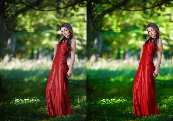
I edited the above picture to illustrate the difference between an application that manages color and one that does not. However, the differences can be much larger.
Since this article frequently mentions the word “gamut,” I will quickly explain what it means because not everyone may know. In simplified terms, it determines how vibrant colors can be displayed.

The above shape represents what the human eye sees (so it could be said that this is the gamut of our eye). There are also marked the most popular color spaces. sRGB is only a portion of what we are able to see, and on the Internet we should use colors limited to this color space. That’s why photos for the web are always saved in sRGB (along with an attached ICC profile). But as I mentioned earlier, the problem is that often what should be displayed as sRGB is shown as if it were in a monitor space which can be much wider, often close to Adobe RGB (especially likely when the photo does not have an ICC profile). As a result, colors start to look completely different than they should.
More tests
If the color management test at the beginning of the post showed that it is working, you can use the following charts to learn more about how your browser handles images and what your monitor is capable of displaying.
Unprofiled photos
Below you can check how your internet browser handles photos that were saved without an ICC profile:


If you see 3 squares and each of them has a uniform color , then even unprofiled photographs will be displayed as if they had an sRGB profile. That’s good. Of course, this only applies to the internet browser you are currently using , not managing color in the entire operating system. If any square is divided into two rectangles, it is wrong. This means that you have a monitor with a color gamut beyond sRGB, but unprofiled photos are displayed in the monitor’s color space instead of sRGB. This results in an over saturated colors of photographs without ICC profile, unnaturally looking skin, radioactive green, etc. Similarly it can be with movies.
You can observe it in the following photo – one is with sRGB profile, the other has no profile at all. With correct color management, both files will look identical, even on wide gamut monitors.


People who have monitors with a color gamut no greater than sRGB will not see any difference. This is how many misunderstandings occur – someone edits a photo on a monitor that cannot display more saturated colors, and assumes that adding a profile to the image doesn’t change anything. Or he even thinks that the profile is causing problems because without it, the picture is closer to what he sees in Windows system preview. However, this person doesn’t know that the preview shows the pictures incorrectly and they will only look this way on this one computer/monitor.
Later someone see this photo on the Internet, perhaps even on a widescreen monitor And wonders what the photographer had in mind, editing the photo in such an absurd way. And all you had to do was attach the profile…
Gamut of the monitor
Below you can see the most vivid colors your monitor is capable of displaying, and how much they deviate from sRGB.


If the above squares have a uniform color (instead of being divided into rectangles of two shades), then your monitor’s gamut does not go beyond sRGB – it is equal to or smaller. It’s not great if you prepare things for printing, but it’s enough for the internet. The plus side is that in other applications besides this web browser, you also won’t have any problems with excessively vibrant color.
Perhaps only some squares will be divided into two shades (then the gamut is not too wide, but larger than sRGB – then you may already have problems in other programs). In pro graphic monitors, the differences are enormous in every square except for the last one. If you had color management turned off, all correct sRGB colors (the ones at the bottom of the squares) in the the photos would be replaced by shades located at the top. So, on widescreen monitors, eyes would be burned with radioactive colors.
Another test:


If the above squares have a uniform color, then your monitor has a smaller color space than sRGB.

If you also do not see the division into two shades (on each of the squares) above , believe me, you do not want to edit any photos on this screen, even if they are only for the Internet. It is also very poorly suited for viewing photographs and probably even a medium-quality smartphone will show you pictures better.
Image dynamic range
This issue is not related to the color management system, but with incorrect settings, the image will be incorrect. This is often caused by connecting the screen via HDMI, less commonly DisplayPort and never DVI, but the last one today it’s not used anyway.
In short – the graphics card can indicate that a signal should be sent as if to a TV, using 16-239 instead of 0-255. Usually, this can be changed in the graphics card driver – find the option responsible for image dynamic range – it must be set to full dynamics, not limited (or RGB not YCbCr).
F.A.Q. – Colors on the Internet
- Which color space should I use to edit photos for the Internet?
In sRGB, and if the photos will also go to print, then in AdobeRGB or ProPhoto RGB (you need a wide-gamut monitor to see the difference). - How to properly save photos for the Internet?
Converted to sRGB color space, with an attached ICC profile. Uploading photos with wider color-space, for example. Adobe RGB is asking for trouble. . - Is there no difference between photos with attached ICC profile and without it?
Of course there is a difference, but you may not see it (because you have a monitor with a gamut no larger than sRGB, or all the applications you used forced to show unprofiled graphics as sRGB). This does not mean that others will not notice the difference. Include profile – always. - After all, other people do not have changed color management settings anyway.
And that’s why ICC files must always be attached. Moreover, if someone cares about accurate colors, they will use a browser with appropriate settings. If you share this article with your friends, more people will have it :). Fortunately, since the end of 2017 almost all computer web browsers manage colors correctly. - But what about the remaining people?
If they have standard gamut monitors, they will be able to see photos without oversaturated colors even with color management turned off, so everything is fine. If they have a wider gamut than sRGB and still didn’t take care of color management, they won’t see the photos correctly. However, as I mentioned, such situations hardly ever occur now. - I uploaded correctly saved photos (sRGB + ICC) to my blog, but they look differently than in Photoshop. WTF?
Blog CMSs often resize images during upload to the server. They can also ignore the profile, as was done in the past by WordPress, for example with thumbnails, drastically reducing the number of people who will see them correctly. To show photos correctly in WordPress, a plugin had to be installed that would take control over it. I have used ImageMagick Engine, however there is currently no need for it anymore, because WordPress now only changes the DPI of the file and it can be any value. – here, I’m explaining it. - And what about Facebook?
While uploading photos on FB, the profile is being removed and replaced by c2 which is sRGB IEC61966-2-1 black scaled. This is sRGB with all irrelevant information removed that does not affect the display of the image but increases file size. Thanks to that, Facebook can profile even the smallest thumbnails and it does so. The images look the same as with a normal sRGB. So in terms of colors, it is very good. Compression is another matter. - How can you make sure that the photos you upload are displayed correctly?
The most universal way is to upload a correctly-prepared photo in the designated place (sRGB with ICC profile, resolution and file size not exceeding those specified in the website informations) , and then download it from there onto your computer to compare it with the original. If the resolution or file size differs, it means that the website has done something with the image. It is also necessary to check if the ICC profile has not been deleted (but it would still be visible in smaller file size). Many programs allow this (for example, Adobe Bridge). On a Mac, just right-click on the image file and select Get Info. If there is only information about the color space being RGB, then there is no ICC profile. If there is also the text: “Color profile: sRGB IEC61966-2.1”, then it’s okay.
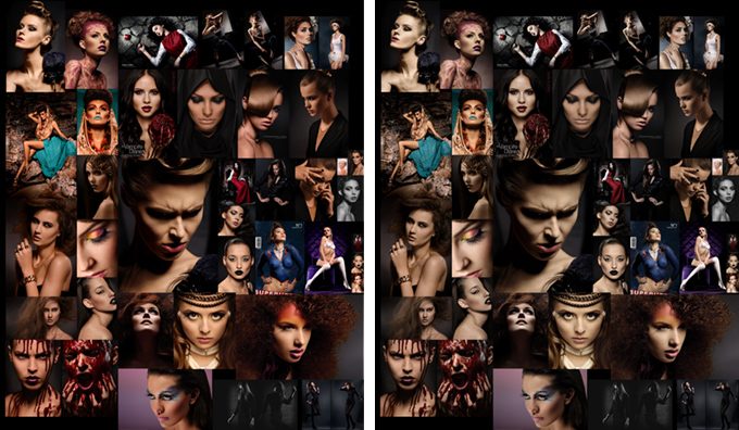
Adobe RGB on the Internet
Some time ago, uploading photos in Adobe RGB color space was a self-inflicted disaster. Such photos in web browsers have become devoid of vibrant colors, skin would acquire a greenish tint, and the overall appearance looked terrible. Even though computer browsers already handle such images well, it still doesn’t make sense to use profiles other than sRGB because a large portion of mobile devices will fail to display them properly and, for instance, Facebook will replace the profile with one that is inconsistent with the real one.
Visualization of how an AdobeRGB image will appear when displayed without color management (the images on the right, and the original in sRGB on the left):
How does color management work in different web browsers?
Computers
Since the end of 2017, most browsers work properly, but sometimes they still cause problems for some people – then usually profiled photos are displayed well, but those without profiles are stretched to the monitor’s gamut (instead of displaying them in sRGB, according to logic).
- On Windows:
Firefox with modified color management settings can be used. It only takes a moment to change them (I’ll explain how to do it later in the article). Then all color problems will disappear, and even unprofiled photos will be displayed as sRGB. Chrome from version 62 should display colors correctly, and if it’s not the case, you can force everything to be displayed in sRGB. The same applies to Opera and Edge, which use the same engine as Chrome. You need to check yourself if it’s OK in other browsers. - On macOS and OS X:
Here it is even simpler, because in the native Safari browser color management works perfectly (from Mavericks system onwards). You can even move the browser between different monitors. With Firefox, you should proceed in the same way as on Windows, that is manually changing the configuration. Chrome behaves similarly on Mac as it does on Windows, meaning that from version 62 everything should be OK, the same as in Opera and Edge. Also added the possibility to enforce sRGB for all files.
It’s best to simply check every browser you want to use using the tests posted in this article. Then you will have the certainty that everything is OK.
However, from what I have noticed, when having multiple monitors, one needs to use the browser on the main monitor. Otherwise, the color space of the main monitor will be recognized as additional screen space and color rendering will be off. Only Safari on macOS/OS X can be moved freely between monitors and the profile will be switched in real time. In Firefox, it is possible to define a monitor profile in the options, while in other browsers this cannot be done.
Mobile devices – phones and tablets
- Apple iOS
The Apple system manages colors from iOS 9.3. All iPhones, iPods and iPads that were released before the introduction of this system had screens with a maximum sRGB color gamut (up to iPhone 6s/Plus, iPhone SE and iPad AIR 2 inclusive). So the colors are correct on them regardless of the system version. Only the iPad Pro 9.7″ and newer have a wider gamut display (DCI-P3). For them, color management is important. In the applications I tested, color management was working correctly. W iOS 9.3 był błąd, przez który w teście z pierwszego akapitu raz pojawia się czerwone pole, innym razem zielone. However, this does not affect the actual color management, it works correctly and in newer iOS such things do not happen. In conclusion – on Apple mobile devices as well as Macs, colors are displayed correctly. - Android
I managed to check that in internet browsers, usually the colors are not like they should be in sRGB, but exceptions do occur.
How to enable full color management in desktop Firefox?
By default, Firefox only displays properly profiled images, but this can be changed and should actually be done.
1. Open Firefox. In the address bar, type about:config and press enter.
2. Locate the position gfx.color_management.mode and change its value to 1.

3. Jut to be sure, also change gfx_color_management..enablev4 to true.
4. In the gfx.color_management.display_profile field, insert the path to your monitor profile. From what I was able to observe, the field is significant when you have multiple screens and want to use Firefox on the one that is not set as primary. But just in case, fill it out even if you only have one monitor.
On macOS/OS X, you will find a profile in:
/Users/user_name/Library/ColorSync/Profiles/Profile_name
If you don’t know which profile is in use, you can check the name in Preferences >Monitors> Color. If the name doesn’t fit entirely in the window, you can click on “Open profile” and see it there.
On Windows:
C:/Windows/System32/Spool/Drivers/Color/Profile_name
5. Restart Firefox.

This is how it looks for me, to use with a built-in screen in the laptop.
An alternative to the above steps is to install the Color Management plug-in (and provide the path to the monitor profile by going to Tools > Add-ons > Extensions > Color Management > Preferences).
How to manage colors in Chrome
Chrome from version 62 should manage colors on standard settings, but it does not work properly for everyone. Fortunately, Chrome can be forced to display everything in sRGB (then in my test, the flag will have two stripes). To do this, you need to enter the address in the URL bar:
Then, you need to find the “Force color profile” option (or go directly to chrome://flags/#force-color-profile and then this option will be highlighted at the very top). If you don’t have this option – update your browser to the latest version.
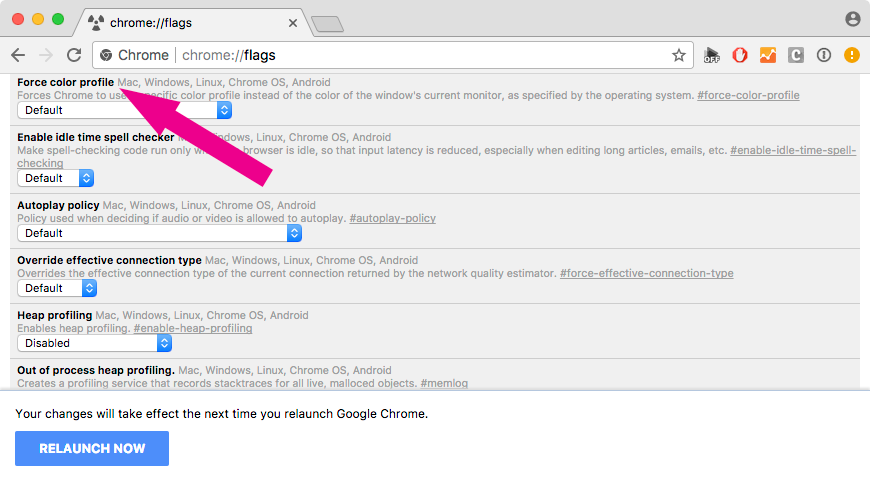 After changing this option from “Default” to “sRGB”, all graphics will be displayed without oversaturated colors.
How to manage colors in Opera
Opera uses the same engine as Chrome, so color management should work the same way. Similarly, it is also possible to force displaying everything in sRGB. To do this, you need to enter that in the address bar:
Next, you need to look for the “Force color profile” option (or directly access it from opera://flags/?search=color%20profile).

After changing this option from “Default” to “sRGB”, all graphics will be displayed without oversaturated colors.
F.A.Q. – colors in other applications etc.
- What color space should be set on the camera? sRGB or Adobe RGB?
If you work with RAW files, it doesn’t matter. If you are creating a JPG or TIFF, it depends on the intended use (see point 2). - In what color space do you edit photos?
If the photos are only for the web and/or minilab-prints, then sRGB should be used (although it’s best to check with the lab because sometimes it may be better to use AdobeRGB and convert files to the minilab profile). However, the color profile from a minilab is never used as a workspace (during editing) instead of Adobe RGB or sRGB. If the photos will also be printed on normal printer, not minilab, then Adobe RGB or ProPhoto RGB will definitely work better, but you need to have a wide-gamut monitor to see the difference on the screen. - My photos look different in Photoshop than in other applications. Why?
Because you watch them in programs that do not manage colors, which simply display these photos incorrectly. Built-in Windows applications have huge problems with color management. You need to use programs that do it correctly and then everything will be OK. Photoshop, on standard settings, displays photos correctly – according to the color space in which they are being edited. - What programs manage colors?
The majority of graphic applications such as Photoshop, Affinity Photo, Gimp, Pixelmator etc. Also many graphic browsers, such as for example ACDSee. Sometimes in the settings, you have to manually enable color management (for example, in Picassa it was like that and IrfanView additionally requires installing a color management plugin to work properly). Look for options in the programs similar to “Color Management”, “Use embedded color profiles” etc. – it should be turned on. Adobe Bridge displays all photos as if they had an sRGB profile (even if they have other assigned profiles or none at all), same goes for Quick Look in macOS and OS X (spacebar on file). Meanwhile, the “Preview” application in macOS nad OS X treats untagged graphics as sRGB, which is the same as a properly configured web browser. In the following section you will find a test that will allow you to check every program that you use. - In Lightroom, I have different colors than in Photoshop, is that normal?
This is possible – you can work in different color spaces on both programs. The Develop module works in similar to the ProPhoto RGB color space, but Soft Proofing can be enabled (in the View menu) to simulate other color spaces, such as sRGB. The remaining modules (Library, Map, Web, Book, Slideshow, Print) use AdobeRGB. In the options under External Editing tab , you can choose the color space in which files will be sent for further editing (eg. to Photoshop). - I have a widescreen monitor and a Windows system. How to live?
As long as you use one monitor, it’s not a tragedy. Native programs are being replaced by third-party applications that manage color. If you are bothered by the fact that the color scheme of the system (program windows, interface, etc.) is oversaturated, you can fix it if your monitor allows for hardware calibration. Switch it to sRGB profile and before editing in Adobe RGB and then back to its native gamut. If you edit photos only for the internet, you can leave sRGB permanently enabled. - Does all of this mean that a wide color gamut only brings problems?
No. There are many benefits and potential problems that can easily be addressed if hardware monitor calibration is possible . Then simply switch it to sRGB if needed. Every currently sold graphic monitor (Eizo CS/CG, NEC PA) can be hardware calibrated, even those from the low-price range (more about monitors suitable for photo editing I wrote here). However, when it comes to Della and other pseudo-graphic hardware that have strange gamuts (sometimes the size of AdobeRGB but not fully covering it) and are only calibrated through software, then I would prefer sRGB. - I calibrated the monitor on Windows and I have even bigger problems than before.
You can create a calibration profile in version 2 or 4. Windows and individual applications do not perform well with the v4, so always create v2. You won’t lose anything from it. - Should the calibration profile be assigned somewhere in Photoshop?
Absolutely not. Under no circumstances shouldn’t it be done. This would turn off color management in Photoshop (more precisely, CM would still work but by stretching the documents to the monitor space, so the effect would be as if color management was turned off). If for some reason you want to display something in this way , you do it through Color Proofing (Monitor RGB option). - I have a Mac. Will I have problems like Windows users?
macOS and OS X natively manage color and display all colors correctly, along with the interfaces of applications and the operating system. It also performs much better with multiple monitors. However, if you use third-party applications, they may show unprofiled files in the monitor profile (for example, Chrome used to do it for a very long time). Safari displays images correctly, similar to most external applications.
Summary
The summary will be very short. Photos should always be saved with attached ICC profiles, so that most people can view them correctly. Additionally, on monitors with a wider gamut than sRGB, it is necessary to use browsers that display unprofiled photos as sRGB.
. . .